Using Excel to identify financial statement red flags
Q. I read the JofA article last month about performing horizontal, vertical, and trend analyses in Excel. How can Excel be used to organize these analyses and highlight possible red flags in a company’s financial statements?
A. Excel is a great tool for integrating various financial statement analyses and presenting the results in a way that emphasizes unusual trends. Combining horizontal analysis, vertical analysis, ratio analysis, and trend analysis into a structured workbook allows accountants to assess changes in profitability, liquidity, and operating efficiency over multiple periods. See the May 2026 Technology Q&A item “Use Excel to Automate Financial Statement Analysis” for an explanation of how to build these financial analyses in Excel. When these analyses are summarized in a dashboard and supported with charts, Excel can help identify patterns that may merit further investigation.
You can download the Excel file used for this walk-through. I used Microsoft Excel 365 for PCs to create this example. Other Excel versions may work differently. The accompanying workbook contains a simplified set of multiyear financial statements. The workbook includes separate worksheets for horizontal analysis, vertical analysis, ratio analysis, and trend analysis, along with a dashboard that summarizes key indicators and visualizes trends that could represent financial red flags.
The analysis begins with a worksheet containing a simplified set of financial statements. The example workbook contains several years’ worth of data for both the income statement and the balance sheet. Key items on the income statement include net sales, cost of goods sold, operating expenses, operating income, interest expense, and net income. The balance sheet features assets like cash, accounts receivable, and inventory, along with liabilities and equity.
Once the financial statement data has been organized, horizontal analysis can be used to measure year-over-year changes in key accounts. Horizontal analysis calculates the percentage change from one period to the next. Large increases in costs relative to revenue growth may signal potential profitability concerns. Vertical analysis expresses each income statement item as a percentage of net sales. Converting values into percentages makes it easier to evaluate changes in the company’s cost structure. Increasing cost percentages may indicate declining operating efficiency or rising production costs.
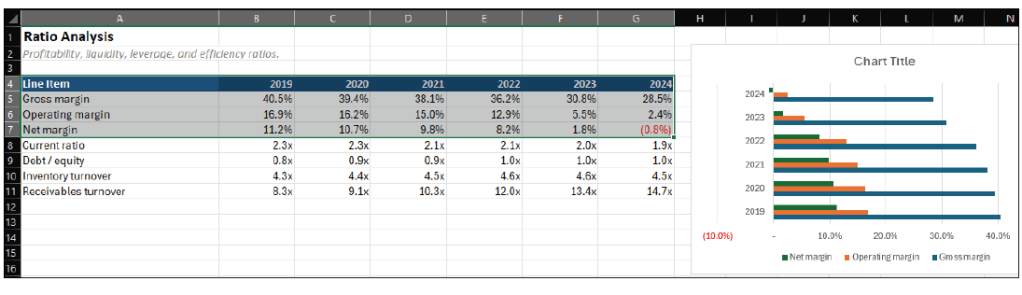
Ratio analysis provides informative insights into profitability, liquidity, and operating efficiency. In the example workbook, various ratios are calculated using Excel formulas, including gross margin, operating margin, net margin, current ratio, inventory turnover, and receivables turnover. These ratios enable accountants to compare financial performance across multiple periods.
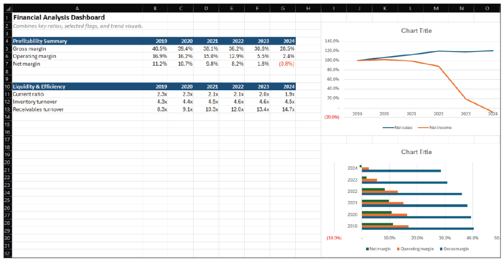
The results of these analyses can be summarized in a dashboard worksheet that combines key indicators into a single view. A dashboard allows accountants to quickly review multiple performance measures without navigating several worksheets.
To create a dashboard similar to the one in the example workbook, begin by inserting a new worksheet and labeling it Dashboard. In the first section of the worksheet, link key profitability ratios such as gross margin, operating margin, and net margin. In the dashboard worksheet, select a row and enter the financial statement years to act as column headings starting with column B. In column A, type labels for Gross Margin, Operating Margin, and Net Margin. To link cells, in the cell where the first value should appear, type an equal sign (=), then navigate to the Ratio Analysis worksheet, and select the cell that contains the corresponding ratio value. Press Enter to create the reference. Copy the formula across the row so that the dashboard displays the ratio values for each year of data. Repeat this process for each labeled row.
A second section of the dashboard can summarize liquidity and efficiency measures. In another area of the dashboard worksheet, use a row for headings, type in the years, and create column labels for Current Ratio, Inventory Turnover, and Receivables Turnover. Use the preceding cell-referencing method to link these dashboard values to the corresponding ratios in the Ratio Analysis worksheet.
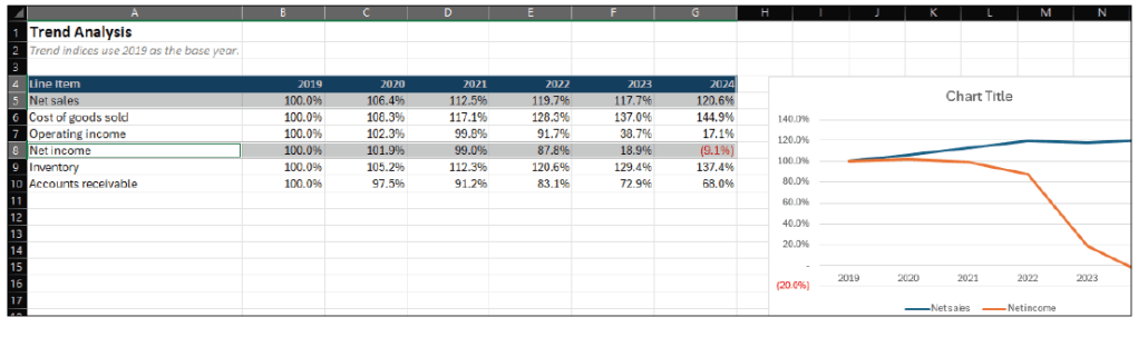
Charts can also be added to visualize trends. To create a chart comparing revenue and net income trends, go to the Trend Analysis worksheet and select the cells containing the year labels and the revenue trend values (A4:G5), hold the Ctrl button, and select the net income trend values (A9:G9). On the Excel Ribbon, select Insert and then choose Line Chart, and then choose More Line Charts from the Charts group. Excel will give you some options. Choose the one you prefer for displaying the data, and adjust the formatting to your liking. The following screenshot shows the chart I found most informative.
Copy the chart and paste it into the Dashboard worksheet so that it appears alongside the ratio summaries. On the Ratio Analysis worksheet, select the rows containing the year headings, gross margin, operating margin, and net margin (A4:G7). Click Insert on the Ribbon and choose Clustered Bar Chart to create a chart showing how these margins change over time. See the screenshot on the following page for the bar chart just created.
Move or copy this chart to the Dashboard worksheet to complete the summary view.
Financial statement analysis techniques such as horizontal analysis, vertical analysis, ratio analysis, and trend analysis are commonly used to evaluate financial performance. However, reviewing multiple analyses across several worksheets can make it difficult to quickly recognize potential warning signs.
Excel offers a practical way to organize financial analyses and present the results in a format that emphasizes important patterns in financial performance. By linking calculations across different worksheets, creating charts to visualize trends, and summarizing key indicators in a dashboard, accountants can enhance traditional financial statement analysis, making it more efficient and visually impactful. See the screenshot below for an example of specific calculations of note, linked from various worksheets and our visualizations, all shown on one sheet, our dashboard.
When used together, these tools allow accountants to quickly identify potential financial red flags and focus their attention on areas that may require further investigation.
About the authors
Kelly L. Williams, CPA, Ph.D., MBA, is an associate professor of accounting at the Jones College of Business at Middle Tennessee State University.
Submit a question
Do you have technology questions for this column? Or, after reading an answer, do you have a better solution? Send them to jofatech@aicpa.org.


