- column
- TECHNOLOGY Q&A
10 types of Excel charts for data visualization
Related
What small firms are getting right about tech and why they’re not alone
Executive turnover slows, but AI strategy remains unclear
Use Excel dynamic arrays to build a revenue-testing schedule that auto-refreshes
TOPICS
Q. My supervisor wants me to include more data visualizations in my projects. Do you have any suggestions?
A. Data visualization transforms raw data into graphical representations, making complex financial information more accessible and understandable. This is particularly important in accounting, where stakeholders must quickly interpret financial trends and make informed decisions based on accurate data. Microsoft has several tools to do this, but I suggest starting with Excel charts. You may think you already know all about them, but Excel keeps adding more, including some that can handle complex information.
To experience the breadth of Excel’s data visualization offerings, let’s take a tour of some of the most useful charts, starting with the basic ones and moving to the more advanced. To follow along, view a video demonstration of Excel chart creation at the bottom of this page.
Note that the content below is based on Microsoft Excel 365 for Pcs. Other versions of Excel may work differently. All the charts and underlying data are available in this Excel file.
As you probably already know, to create a chart, you select the data you want visualized and go to the Insert tab on the ribbon. In the Charts group, select the type of chart you want to create. From there, give your chart a name. You can also do any additional formatting you would like, including choosing from more than a dozen types of charts. Here are 10 I recommend trying.
BAR AND COLUMN CHARTS
Bar and column charts are essential tools in financial analysis. They help present data clearly and visually. Bar charts show data with horizontal bars, while column charts use vertical bars. These charts are great for comparing different datasets or monitoring changes over time. See below for an example of both a bar and a column chart displaying the quarterly revenue for each quarter for each department.

LINE CHARTS
Line charts help you spot long-term trends by connecting data points with straight lines. This is particularly helpful for tracking revenue, expenses, and profit margins over months or years. Line charts can also help compare multiple datasets on a single chart by using different lines for each set. This allows you to see how different financial metrics relate to one another over time. The screenshot below shows an example of a line chart visualizing the monthly amounts for revenue, expenses, and profit.

PIE CHARTS
When you need to show how different categories contribute to a total, pie charts provide a clear picture. For instance, you can illustrate the distribution of expenses across various departments in your organization. Displaying percentages through pie charts helps in situations where understanding the share of each component is crucial; for example, presenting the market share of products in your portfolio. See below for an example of a pie chart displaying the expenses distribution for each of our departments.

COMBO CHARTS
Combo charts in Excel are a powerful way to combine different types of charts into one. You can merge bar and column charts, line charts, and even pie charts to create a single, cohesive visual representation of your data. This versatility makes combo charts ideal for a financial analysis requiring multiple data points to be compared simultaneously. The screenshot below shows a combo chart for the revenue and profit margin for each month and for each category of revenue and profit margin this company maintains.

WATERFALL CHARTS
Waterfall charts, also known as bridge charts, help you visualize the cumulative effect of sequentially introduced positive or negative values. This is especially useful for understanding how individual items contribute to a total, such as analyzing profit margins or cost breakdowns. See below for a screenshot of a waterfall chart showing the addition of revenue in December, then the reduction from cost of goods sold, and the subtotal of gross profit, all in a visual sense. It then shows the reduction due to operating expenses and, finally, the total net income.

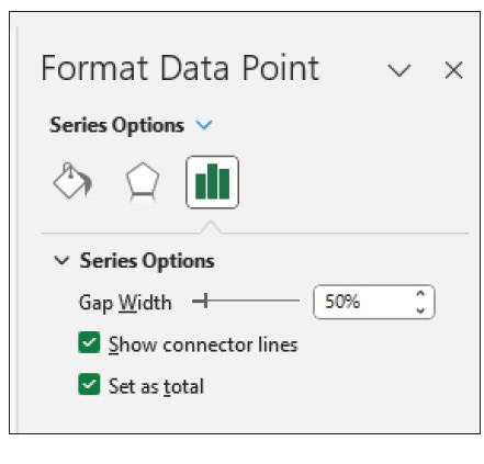
If your data contains values considered as subtotals or totals, like Cost of Goods Sold or Net Income, you can anchor these values to start from zero on the horizontal axis, preventing them from “floating.” To do this, click on a data point in the chart, right-click, and choose Format Data Point to open the task pane. Then, check the Set as total box, as shown below.
FUNNEL CHARTS
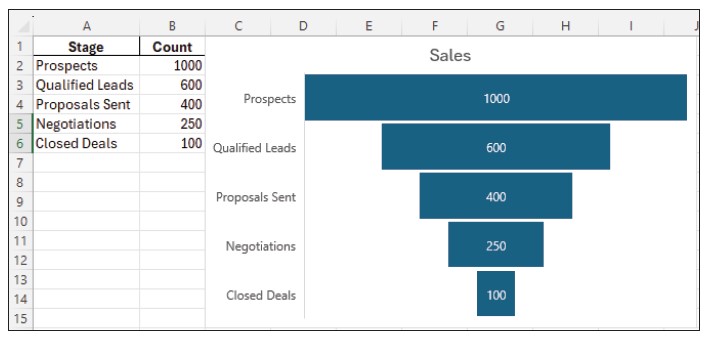
Funnel charts are ideal for visualizing stages in a process, like sales pipelines or customer acquisition funnels. By showing the progressive reduction of data at each stage, these charts help you identify bottlenecks and areas for improvement. The screenshot below shows an example of a funnel chart displaying the reduction in amounts between prospects and the qualified leads we get from those prospects. That leads us to the proposals set, then negotiations, and, finally, closed deals.
HISTOGRAM CHARTS
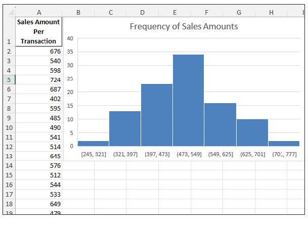
Histogram charts offer a way to display the distribution of numerical data by dividing it into bins or intervals. This type of chart is excellent for displaying frequency distributions, making it easier to understand the underlying patterns in your financial data. The screenshot below shows a histogram chart for the frequencies of certain dollar amounts of sales. For example, the sales amounts between $473 and $549 are the most frequent.
BOX AND WHISKER CHARTS
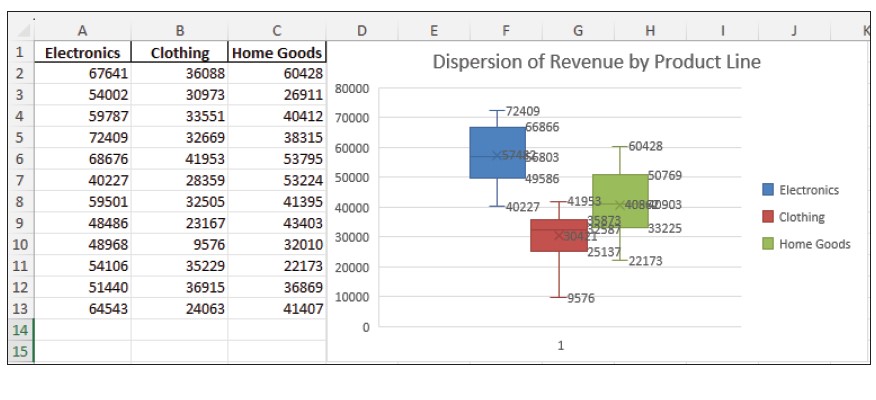
Box and whisker charts provide a visual summary of one or more sets of data highlighting their distribution and spread. They are useful for identifying outliers and understanding the dispersion and skewness of your data, which can be particularly beneficial in risk assessment. Below is an example of a box and whisker chart depicting the dispersion of revenue by product line.
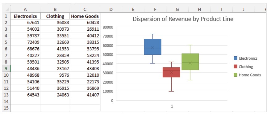
To better illustrate the graphics in this chart, I created another box and whisker chart for this same dataset that shows the numbers.
TREEMAP CHARTS
Treemap charts use nested rectangles to show hierarchical data as a proportion of a whole. This type of chart is ideal for displaying large amounts of hierarchical information, such as organizational structures or portfolio allocations. See below for an example of a treemap chart showing the revenue contribution for each electronics area and its products.

SUNBURST CHARTS
Sunburst charts are another way to visualize hierarchical data. They represent each level with concentric circles, making it easy to see the contribution of individual components within the hierarchy. This can be used effectively for displaying multilevel financial metrics. See the screenshot below for an example of a sunburst chart depicting the revenue distribution of an electronics store.

About the author
Kelly L. Williams, CPA, Ph.D., MBA, is an associate professor of accounting at the Jones College of Business at Middle Tennessee State University.
Submit a question
Do you have technology questions for this column? Or, after reading an answer, do you have a better solution? Send them to jofatech@aicpa.org.
AICPA & CIMA RESOURCE
CPA self-study course: Data Visualization


