- column
- TECHNOLOGY Q&A
Understanding PivotTables and Excel’s Recommended Charts
Please note: This item is from our archives and was published in 2020. It is provided for historical reference. The content may be out of date and links may no longer function.
Related
What small firms are getting right about tech and why they’re not alone
Executive turnover slows, but AI strategy remains unclear
Use Excel dynamic arrays to build a revenue-testing schedule that auto-refreshes
TOPICS
Q. I love using Excel but know I’m not getting the most out of it. What would you recommend to boost my Excel productivity quickly?
A. I get questions like this a lot. People like many Excel features but don’t have the time or energy to learn a bunch more. Well, there is good news for those who fit this description. Just like our mobile phones are “smart” these days, Excel is pretty smart now as well.
In many cases, you simply need to click a few buttons and Excel will do the work for you. This article shows you a couple examples. Click here to download an Excel file with separate worksheets for each tip. You can also view a video for the second tip at the bottom of this page.
Note that the content of this article is based on Microsoft Excel 365 for PCs. Other versions of Excel may work differently.
PivotTables
PivotTables are extremely useful tools. They allow the user to summarize and analyze large quantities of data. However, creating a PivotTable seems to be a daunting task to many who have not yet learned about them. As of Excel 2013 and later versions, Excel can create PivotTables for you. Click anywhere in your dataset, click on the Insert tab, and select Recommended PivotTables from the Tables group (shown in the screenshot below). If there is enough data, Excel will give you some options of PivotTables to choose from. Click any of the recommended PivotTables to preview how your data will look in the PivotTable.

Once you choose the PivotTable you want, click OK. By default, your PivotTable will appear on a new worksheet. You can leave the PivotTable as is, or you can modify it. Click anywhere in the PivotTable and the PivotTable Analyze and Design tabs will be added to the Ribbon. You can make any desired modifications to your PivotTable from those tabs. We will use a PivotTable in the answer to the next question in this column.
Recommended charts
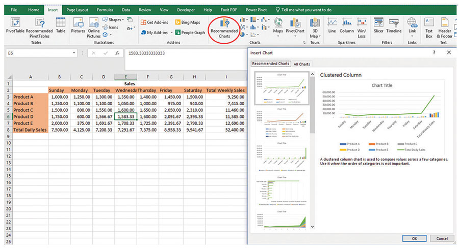
The number of charts Excel has to offer can be overwhelming. Excel 2013 and later versions can determine the right charts for your data, make recommendations, and create the chart for you. Click anywhere in your dataset, click on the Insert tab, and select Recommended Charts from the Charts group (as shown in the screenshot below). Click on any of the recommended charts to preview how your data will look in the chart.

Once you choose the chart you want, click OK. You can leave the chart you chose as is, or you can modify the chart. Click anywhere in the chart and Chart Design and Format tabs will be added to the Ribbon. You can make any desired modifications to your chart from those tabs.
About the author
Kelly L. Williams, CPA, Ph.D., MBA, is an assistant professor of accounting at Middle Tennessee State University.
Submit a question
Do you have technology questions for this column? Or, after reading an answer, do you have a better solution? Send them to jofatech@aicpa.org. We regret being unable to individually answer all submitted questions.


