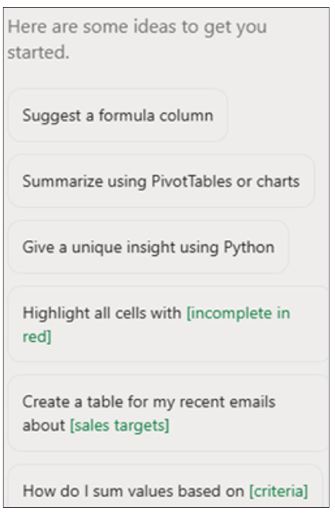
AI tools for finance professionals to prepare and visualize data
AI tools are frequently used in data visualization — this article describes how they can make data preparation more efficient and automate visualizations.

In this article, I am going to consider the artificial intelligence (AI) and machine-learning tools available to assist finance professionals with the preparation of visuals.
Here, I will cover the following:
- Automation using AI tools.
- Further use of AI tools: Pattern recognition, anomaly detection, and clustering/dimension reduction.
- How to choose the right AI tool.
This article is not about ethics, privacy, security, ownership, or corporate governance — I am going to circumvent all of this here by using some made-up data relating to supermarket sales:
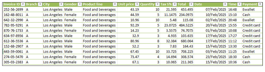
Here, I have a sample dataset of approximately 1,000 rows that is relatively lightweight (in terms of number of records) and “somewhat” clean, with various fields such as date, time, product line, payment method, unit price, quantity, and so on, for analysis. Let’s see how the various tools available to accountants assist us with our work.
Data cleansing
It is only once we have cleaned our data — learning what we must do depending upon the data selected — that we can proceed to the next stage of our data visualization journey. AI can assist here: For example, we can ask it to remove duplicate entries or even null values as demonstrated later.
Automation
There may be much repetitive data cleansing, reshaping, summarizing, and refreshing before creating our visuals. The goal is to only ever have to prepare it once and let automation pick up the heavy lifting thereafter.
Here are several tools we can use depending on the user’s skills and knowledge:
- Power Query/Get & Transform for repeatable transformations in either Excel or Power BI.
- VBA macros/Office Script coding for Excel-only automation.
- Python (or even R, SQL, and similar) for more advanced and large-scale automation.
However, can you use Power Query well? Are you a keen VBA or Python coder? For the vast majority of you, the answer is probably a resounding “No!” And that’s where AI can assist.
AI tools in automation
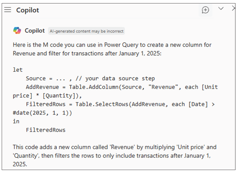
Let’s consider using AI to help us in our quest in taking datasets and turning them into the required visualizations. Copilot seems to be the obvious choice for assisting us. We can combine it with Power Query as follows.
We may create a prompt describing the transformation and allow Copilot to write the steps (in M) so that we may tweak them accordingly. To use M code in Power Query, you can create a “Blank Query.” In the Power Query Editor, go to “New Source” and then “Blank Query.” Open the Advanced Editor for this blank query and paste your M code copied from Copilot.
“Write the M code to create a new column that calculates Revenue = Unit price * Quantity, then filter for transactions after 1 Jan 2025.”
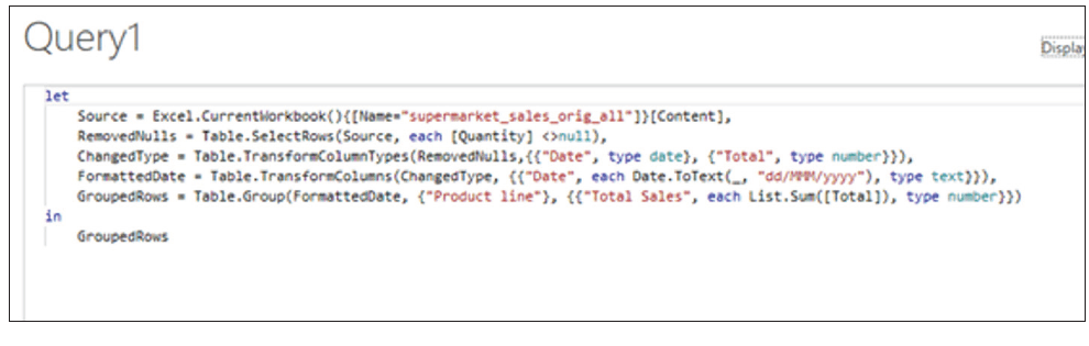
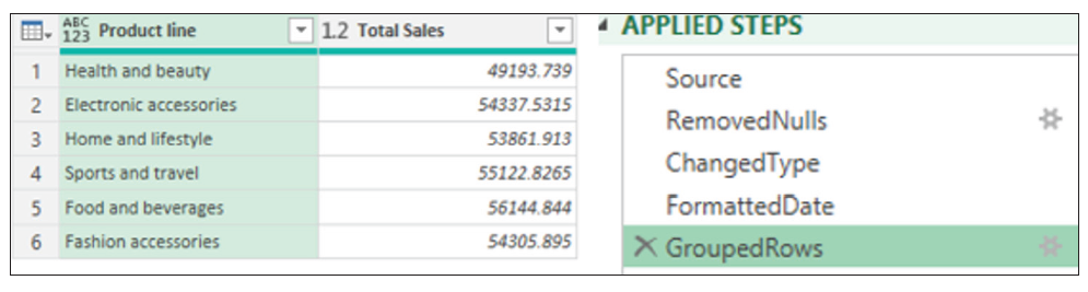
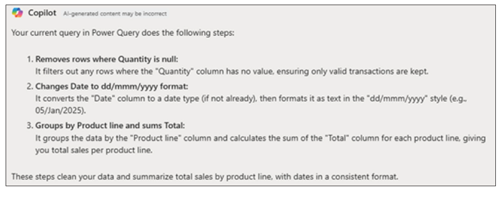
Further prompts can be added to remove rows/records where the Quantity is null, and change the Date field to dd/mmm/yyyy format (UK format) and group the Product line to sum the Total:
For documentation — and possibly so that we understand precisely what has occurred — we can even ask Copilot to explain the current query:
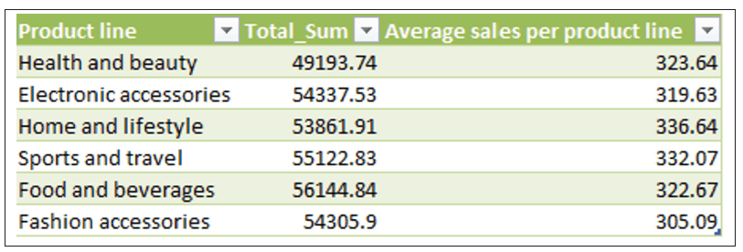
Copilot in Excel cannot directly work with Power Query (as of the time of this writing) to add a column. However, it can guide you to add the column in the output table:
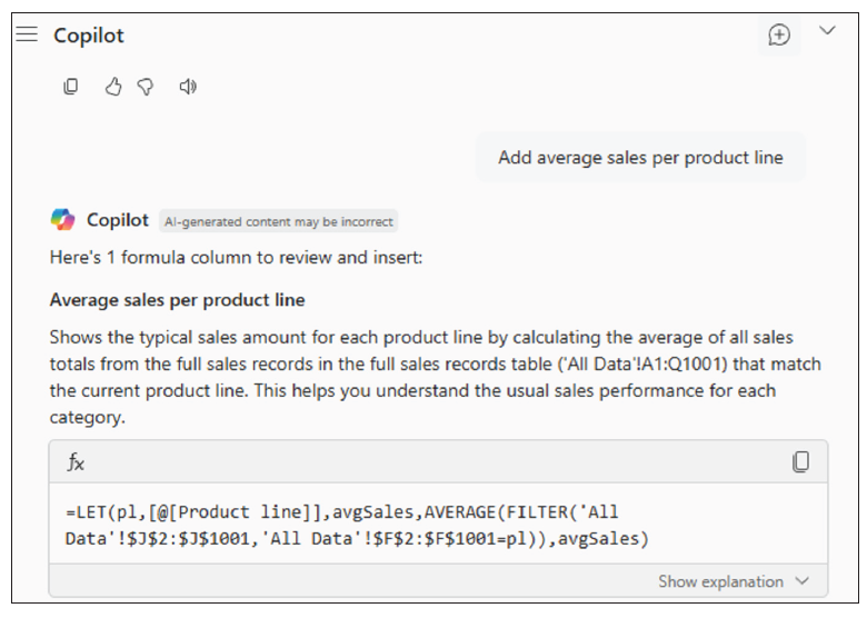
And here is the new output Table with the new column added.
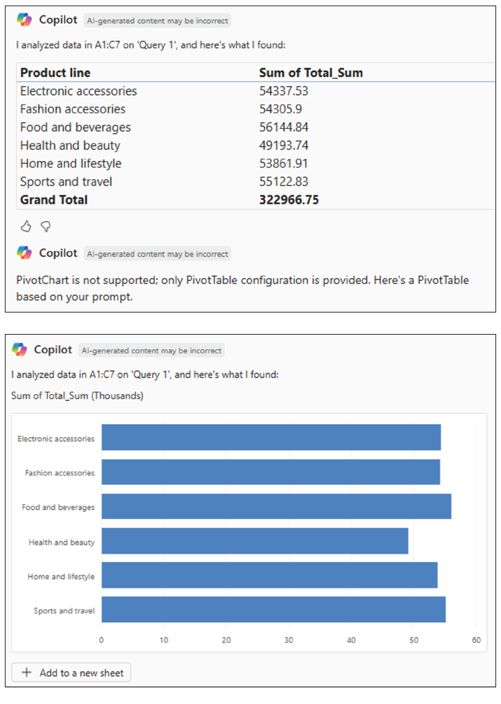
We can then ask Copilot to create the PivotChart using another prompt:
“Create the PivotChart of this Power Query output table.”
Using Copilot’s suggestions, we can also ask follow-up questions:
This means that Copilot can automatically write formulas and new helper columns from a natural-language request. It can also generate Python code (e.g., using Pandas/Matplotlib) directly in the grid for grouping, charts, outlier flags, and so on. For example, we could ask:
“From this table, create a Revenue column = Quantity * Unit price; then a Month (mm-yyyy) column.”
“Write Python to aggregate Monthly revenue by Branch and save a chart to the worksheet; also compute female/male revenue ratio by Product line.”
But we could go further. Using Copilot and Power Automate, we could automate the complete set of flows via our prompts. In the supermarket case, we could ask Copilot:
“When supermarket_sales.csv is added to the /Sales/Incoming directory, run a Power BI dataset refresh and email the updated Product line chart to Finance.”
“Create a desktop flow: open Report.xlsm, run macro CreatePQ_Pivot_Chart, save the chart as PNG, and then close the file.”
We are perhaps ready for further assistance using AI.
Further use of AI tools
Pattern recognition
Continuing with our Supermarket Sales file, we can use AI tools to recognize patterns such as:
- Sales trends (e.g., up/down over months or seasons).
- Customer behavior differences (gender preferences, branch differences).
- Product performance (best/worst product lines).
- Outlier transactions (extreme purchase amounts).
For example, considering the first idea of sales trends, we could generate the following prompt:
“Using the Power Query output table, group sales by Month, plot the trend line, and highlight months with >10% drop vs. previous month.”
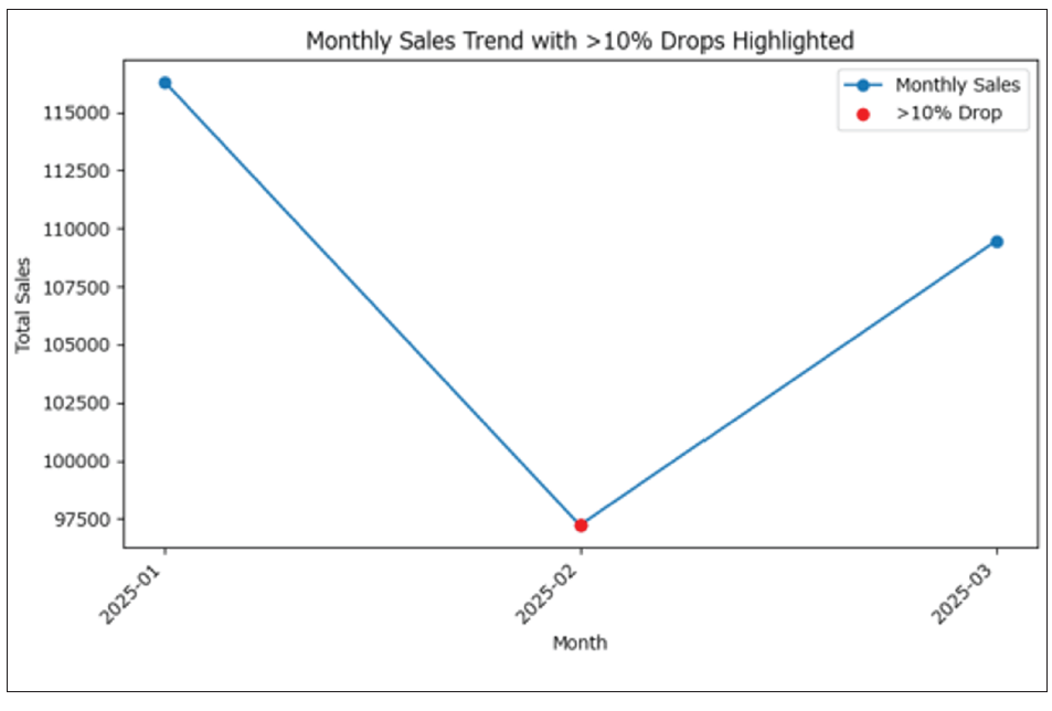
It’s not the most exciting chart I have ever created, but you get the idea. The monthly sales trend has been plotted. Months with more than a 10% drop compared to the previous month are clearly highlighted. This makes it easy to spot when significant declines in sales occur over time.
Returning to my above list of ideas, we could upload the csv to ChatGPT (if the dataset is not sensitive or confidential) and ask targeted prompts to obtain Pandas output and visualizations. The prompt might be as follows:
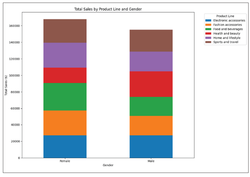
“Show male vs. female sales preference by Product line and compute the difference of total purchase amount in %.”
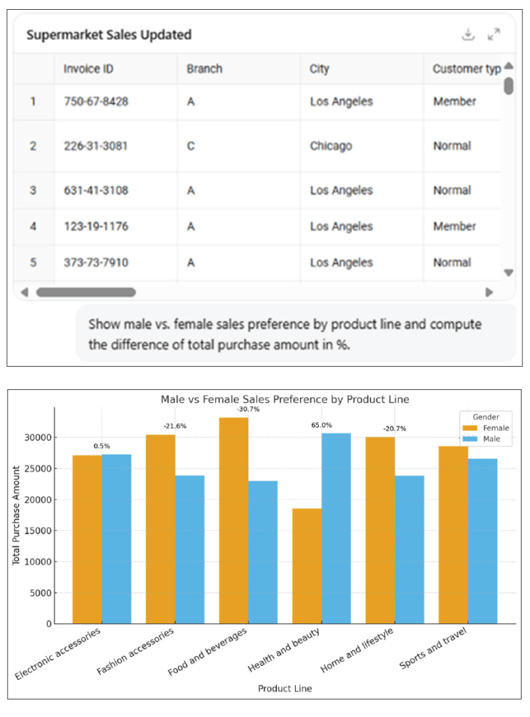
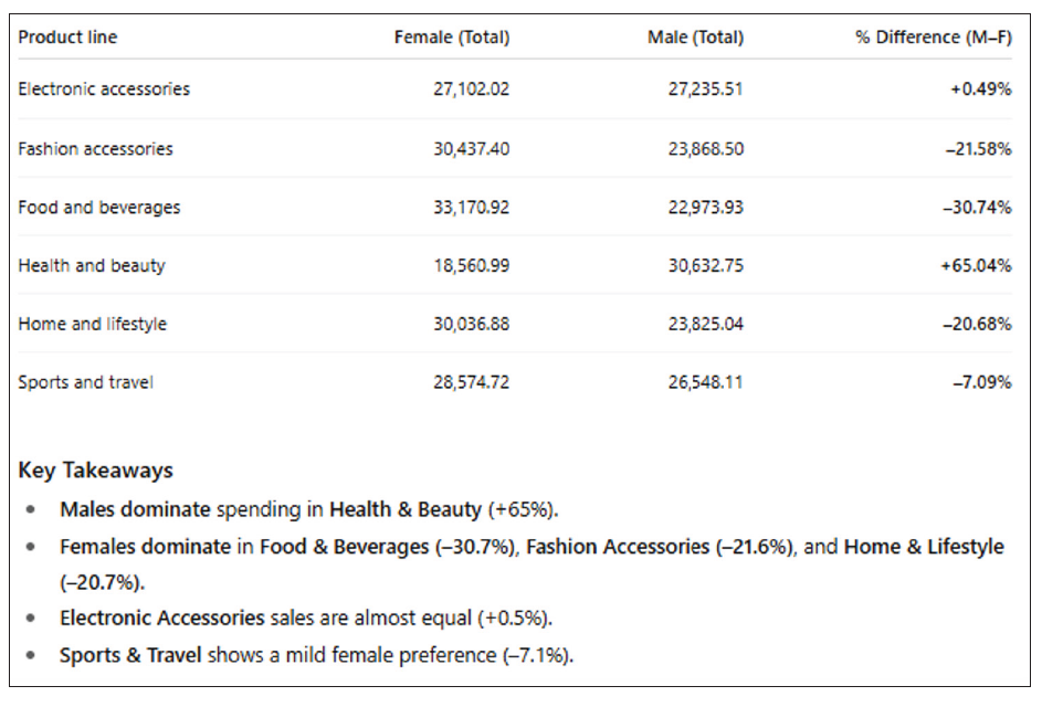
AI tools such as ChatGPT are good at advanced data analysis and can recognize patterns in the dataset. In this case, we can see that ChatGPT 5 handles Supermarket Sales csv and can explain patterns in plain English while outputting high-quality visuals.
We can look at alternatives. For instance, Google Gemini Advanced, similar to ChatGPT, just needs us to paste or upload a sample table and ask pattern questions:
“Identify any seasonal patterns or gender-based purchasing trends in this supermarket sales dataset. Show visualizations.”
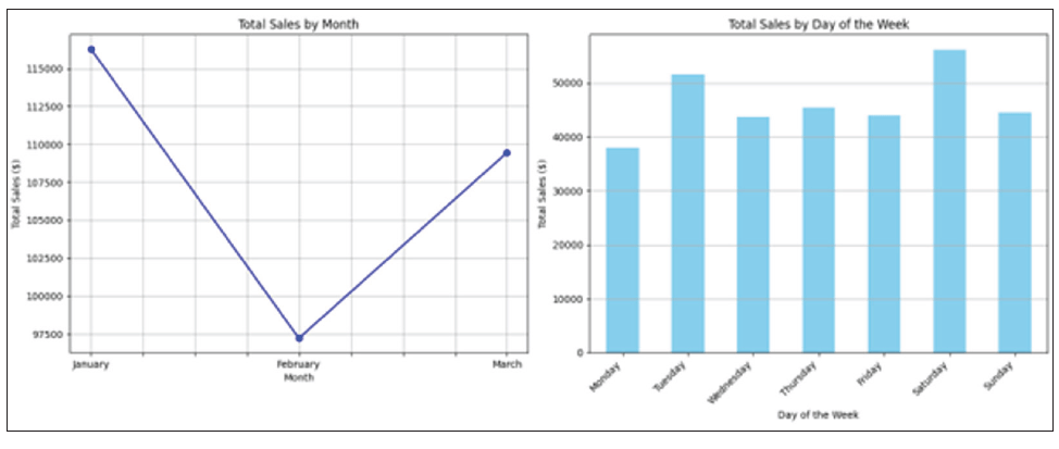
Seasonal patterns recognized included:
- Monthly sales: The dataset showed a slight upward trend in total sales from February to March.
- Sales by day of the week: The sales were relatively consistent across all days of the week, with a notable peak on Saturday and a slightly lower dip on Monday.
Gender-based purchasing trends were also discoverable:
- Males and females had different purchasing habits across some product lines.
- The total sales for each product line are roughly equal for both genders, suggesting no significant gender-based purchasing trends in this dataset.
Anomaly detection
AI tools can help to detect anomalies that can distort visualizations and lead to wrong conclusions. Again, using our Supermarket Sales dataset example, we had the following issues (probably recognizable to many of you):
- Extreme Total Sales values: If one transaction has an unrealistically high Total, it may push the y axis so much that all other bars were too small.
- Negative values (if introduced by error): Refunds or incorrect data entry recorded as Sales.
- Unexpected Date entries: A sales date outside the expected range (dataset is only three months in 2019).
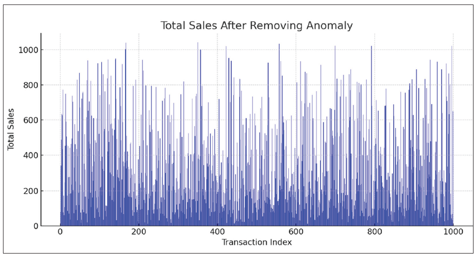
Using ChatGPT, I added a fake outlier of $100,000 sales to see how ChatGPT detected and highlighted it.
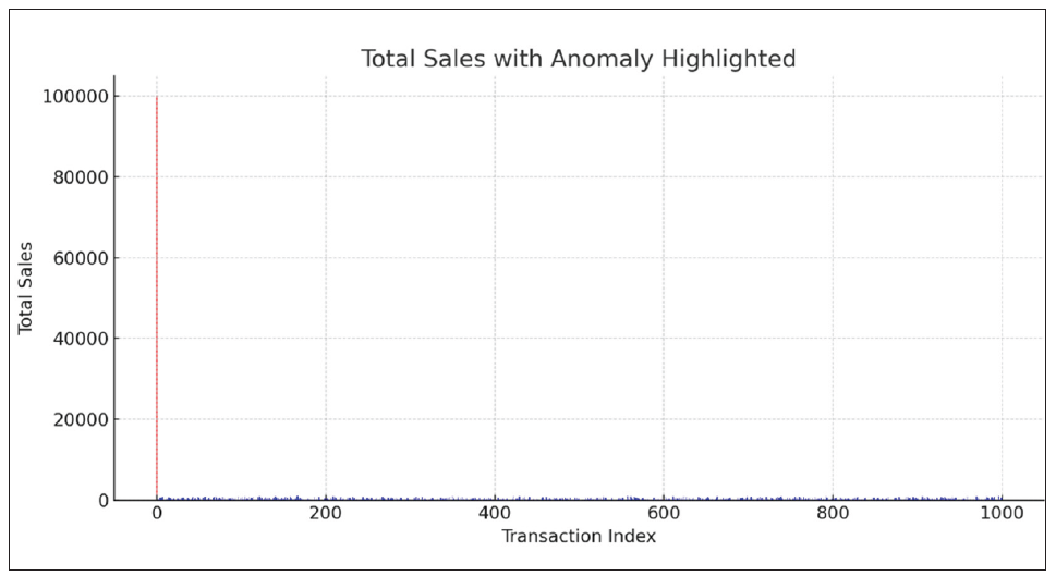
Before cleaning the fake $100,000 sales (red bar), the chart skews the scale, so all other sales are unreadable. After removing this anomaly, the chart becomes readable, and trends are (somewhat) clearer:
Next, let’s load the Supermarket Sales dataset with “just” a $10,000 sales anomaly and ask Power BI Copilot:
“Highlight outlier transactions in total sales and show them in a scatter chart.”
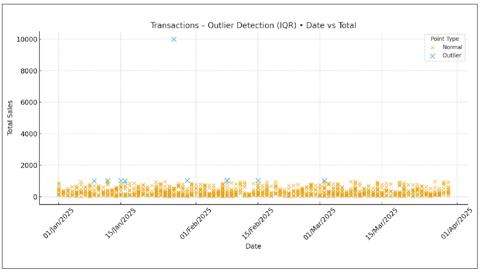
By doing so, we can produce an interactive dashboard, where anomalies can be dynamically filtered.
Time to look at Python once more. This example uses the Z-score method to detect unusual sales in the supermarket dataset.
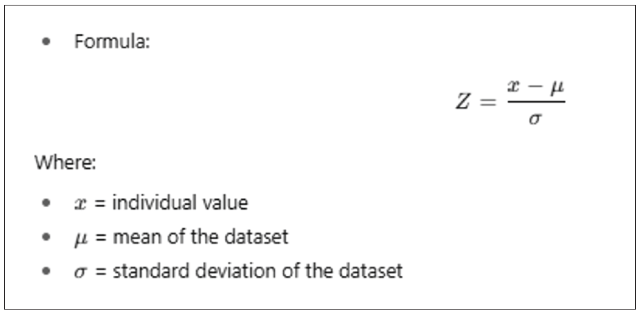
If the absolute value of Z is large (commonly > 3), the data point is considered an outlier because it’s unusually far from the average compared to the rest of the data. We may calculate how far each transaction’s Total value is from the average in units of standard deviation. Any transaction with a Z-score above 3 or below -3 would therefore be marked as an anomaly.
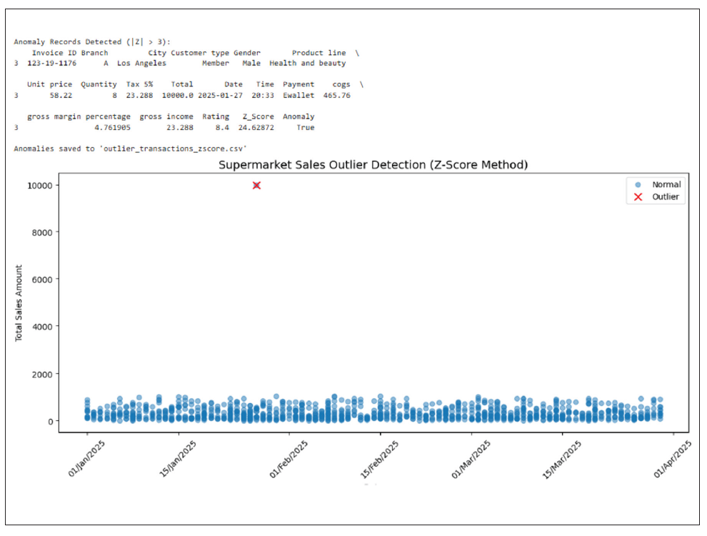
On the resulting chart, blue bars are normal sales, whereas the red cross represents the anomalies with annotated values (and Invoice ID if present). I wouldn’t say that it is exactly clear, but the chart could be modified.
Clustering/dimension reduction
Returning to our example, supermarkets often have thousands of stock keeping units. Showing all products in a single chart is essentially unreadable. Instead, we should consider grouping them into categories or product lines. AI can help by automatically clustering similar products or using dimension reduction to show high-dimensional data in fewer and more meaningful categories.
We can use data visualization tools such as Tableau or Power BI to automate clustering visuals:
This Tableau clustering shows customer groups with similar buying behaviors, helping retailers target promotions, optimize product placement, and improve sales strategies based on purchase patterns.
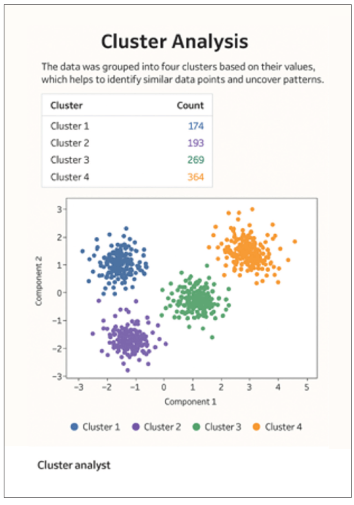
We can also use Python to generate a clustering visualization for the Supermarket Sales dataset using the scikit-learn library.
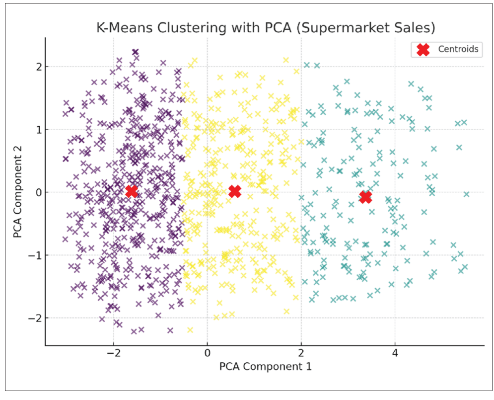
The two principal components (known as PC1 and PC2) are the new synthetic variables created by PCA (principal component analysis) to capture the most important patterns in the data:
- PC1 (x axis): The direction in the data that explains the largest variance. In our case, it’s likely a combination of Total Sales, Quantity, and Unit price, meaning it separates transactions with high-value, high-quantity purchases from smaller transactions.
- PC2 (y axis): The second most important direction, uncorrelated with PC1, capturing additional variation. It could be influenced by Customer Rating or Gross Income, separating transactions with similar totals but different customer satisfaction or profit margins (say), with differing strengths of relationship.
Three clusters were detected after reducing the original features to two principal components. Dots represent transactions, whilst red X markers are known as the cluster centroids. This visualization helps identify similar transaction patterns, such as groups of customers with similar purchase amounts, quantities, or ratings.
How to choose the right AI tools
Given I have already mentioned several AI tools (but there are others as noted below), perhaps it’s time to provide a summary of the AI tools that are frequently used and when they might prove useful.
ChatGPT
With advanced data analysis, uploading files, and asking for automated chart generation ideas, you can get Python/Plotly/Matplotlib code to build these interactive dashboards.
When you need quick code-based prototypes or want to evaluate ideas before building in your favorite business intelligence (BI) tool, ChatGPT is often a simple and quick performer, e.g.,
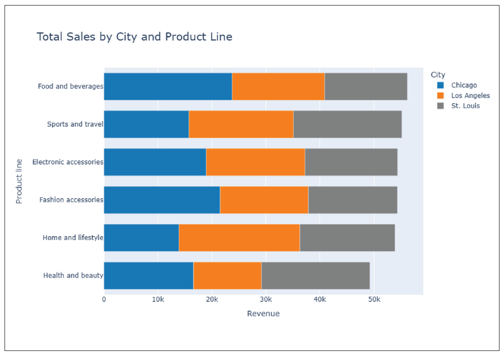
“Show an interactive bar chart of Total Sales by City and Product Line, sorted by highest Sales.”
Claude
When you already have visuals but want narrative insights, Claude is often a viable choice, especially as data uploaded is not used to train AI. As an example, you could ask it to explain anomalies in charts where you have uploaded the “Total Sales by Month” chart. Claude will explain the outlier:
“February sales spike in Los Angeles due to higher Electronics and Accessories purchases during promotions.”
Copilot
Power BI Copilot is useful when the data is already loaded in Power BI and you require faster chart building without going deep into DAX coding. For example:
“Show average gross income by Gender per Product line.”
Copilot will suggest a stacked column chart and the DAX measure Average Gross Income.
Excel Copilot is also a good choice when the workflow is to Excel first and foremost. It can help to build charts and even maps or conduct deep analysis from plain language, e.g.,
“Create a monthly trend line of total sales for each city.”
Gemini
Gemini is integrated with Google Workspace and works well with multimodal reasoning (can read charts and images), making it a useful option for quick prototype charts.
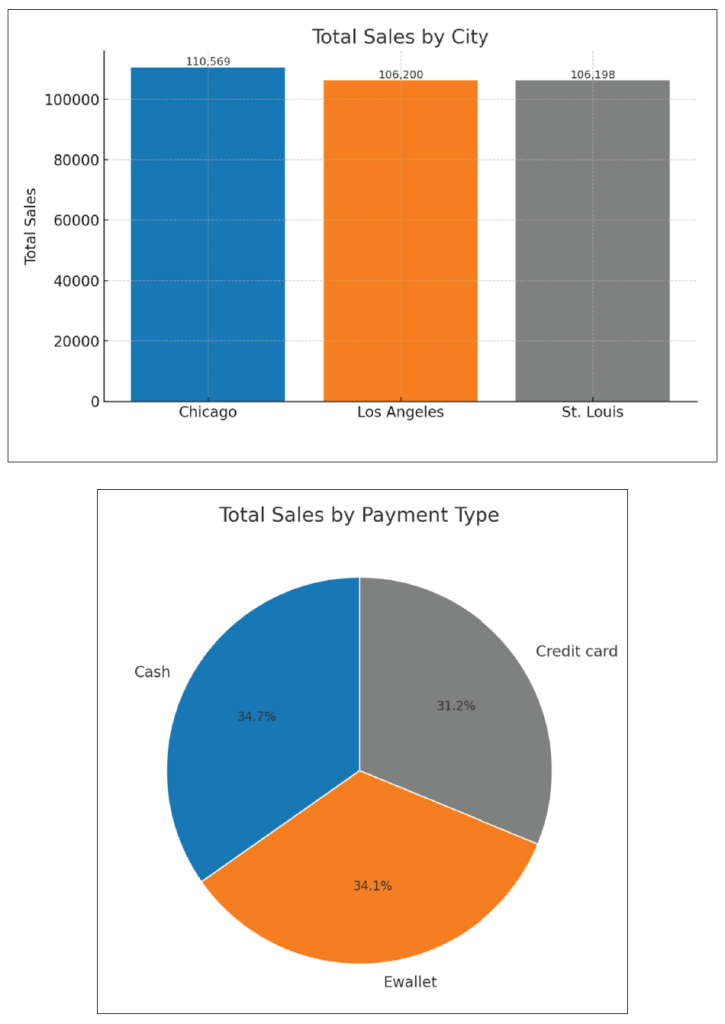
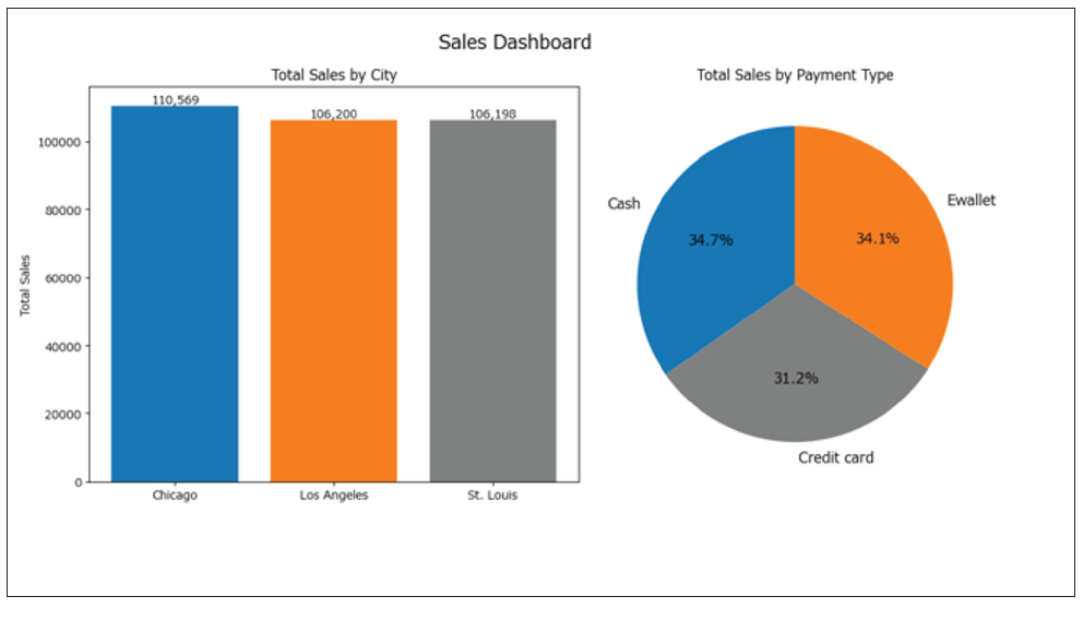
“From this dataset, show a grouped bar chart of Total Sales by City and Product line, sorted highest to lowest, and explain in 3 sentences.”
Output:
Gemini has created a chart, but no matter what basis you wish to assume, it has clearly not sorted the total sales in descending order. This is where a second prompt should be given, challenging this initial output.
I do note that the highest-selling product line in total for all cities is food and beverages, with the city of Chicago having the highest total sales for this category. Conversely, health and beauty is not so popular in Chicago and Los Angeles but is a stronger performer for St. Louis. This suggests that while product preferences are similar across locations, there are differences in overall sales volume per city. Furthermore, Gemini did provide three sentences of commentary:
- Chicago is the leading city overall for sales, especially strong in food and beverages and electronic accessories.
- Los Angeles outperforms the others only in home and lifestyle, indicating a localized consumer preference.
- St. Louis is competitive in health and beauty and in sports and travel, suggesting a different purchasing pattern compared to the other two.
It should also be noted that since June, Gemini has been able to produce fully editable charts that regenerate if the spreadsheet data changes, which positions it ahead of its peers at the time of this writing. If you want to customize your charts simply, Gemini may prove to be a preferable option.
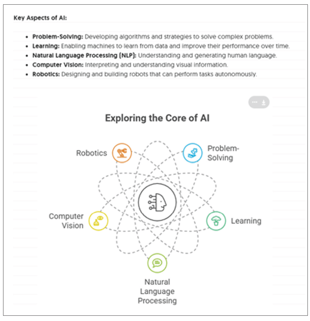
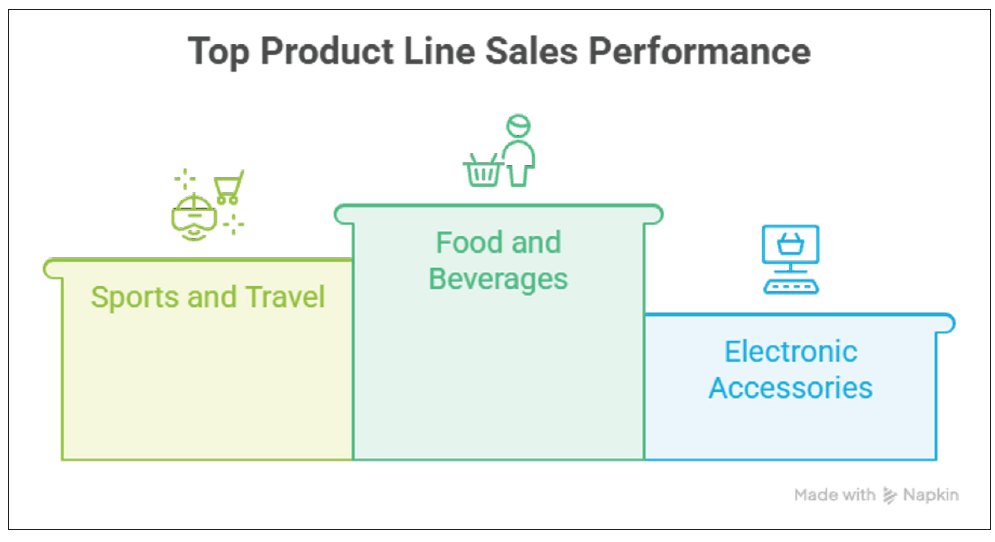
Napkin AI
For quick conceptual charting, Napkin may be a good choice. It is extremely fast for idea visualization without full BI setup and no coding required, making it great for quick storytelling visuals.
“Paste the key aspects of AI and generate the visuals that can be used in PPT slides.”
We can also import the Supermarket Sales dataset into Napkin and generate the picture. Unfortunately, it doesn’t seem to work well at present for large datasets (e.g., more than 500 records).
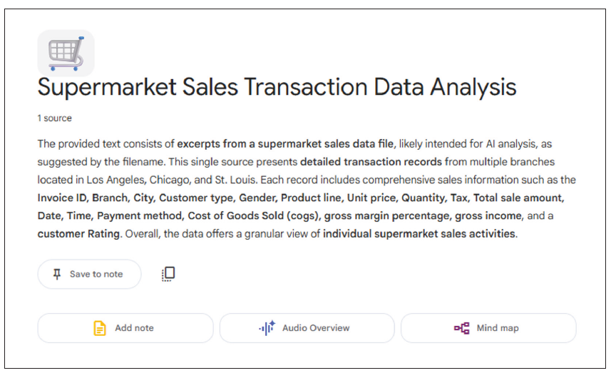
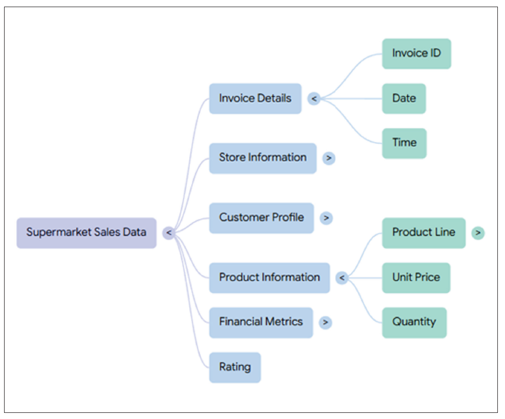
NotebookLM
For insight-rich analysis, NotebookLM may be noteworthy. It combines reference-based AI with multidocument context, producing linked insights and citation, e.g., if you convert supermarket_sales.csv to PDF or Google Doc, you may then ask:
“Summarize sales trends by City and Product line and create a mind map.”
NotebookLM returns a short summary, a source reference, plus a mind map:
Please forgive me if I have not included your AI favorite. This list is only a small sample of AI tools.
Impact of natural-language interactivity
It should also be remembered that the chart type and output can change automatically depending upon how the question is written.
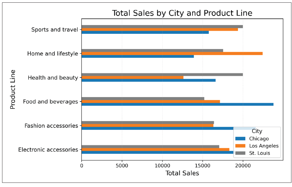
For instance, before we ask Copilot to create charts of the data, we can initiate deeper learning (known as advanced analysis mode) that is good at uncovering more complex patterns and relationships in the dataset, e.g.,
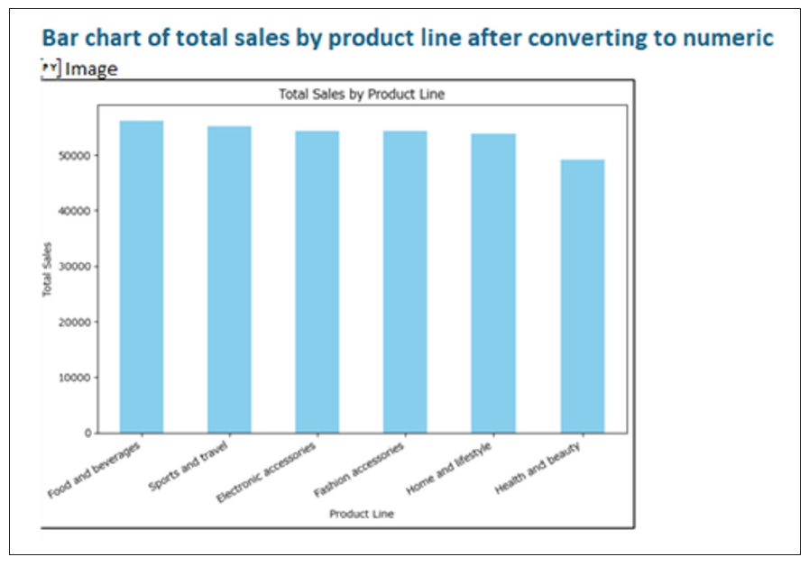
“Show total sales by Product line.”
In this case, a bar chart has been created to show the Total Sales for each Product line.
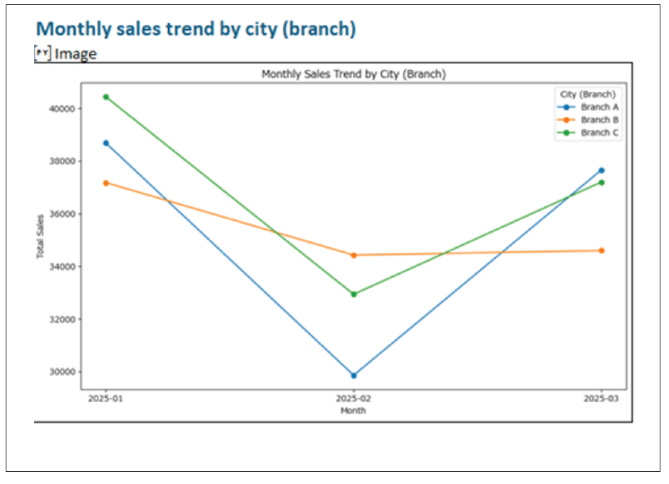
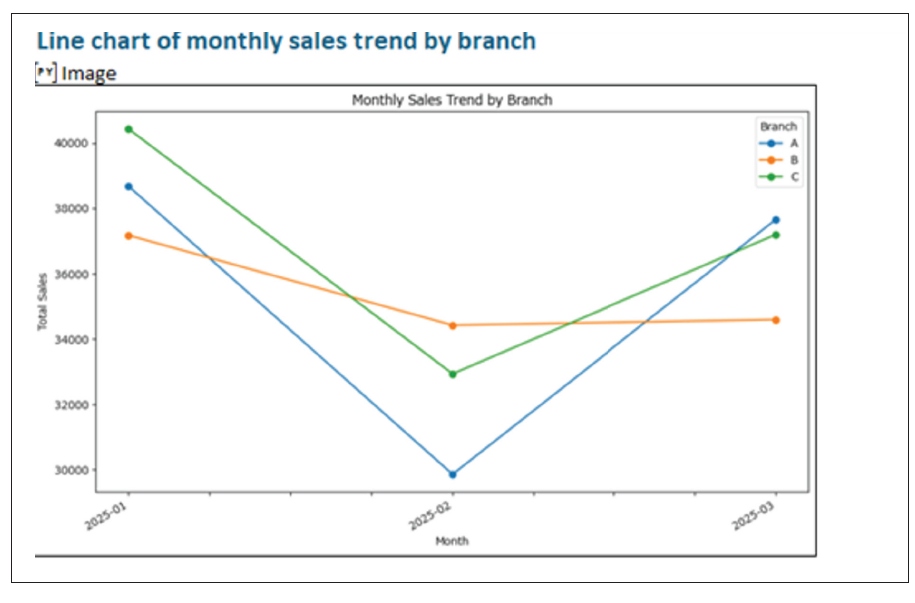
Compare and contrast this to:
“Show monthly Sales trend by Branch.”
Here, a line chart is provided for visualizing monthly Sales trends by Branch.
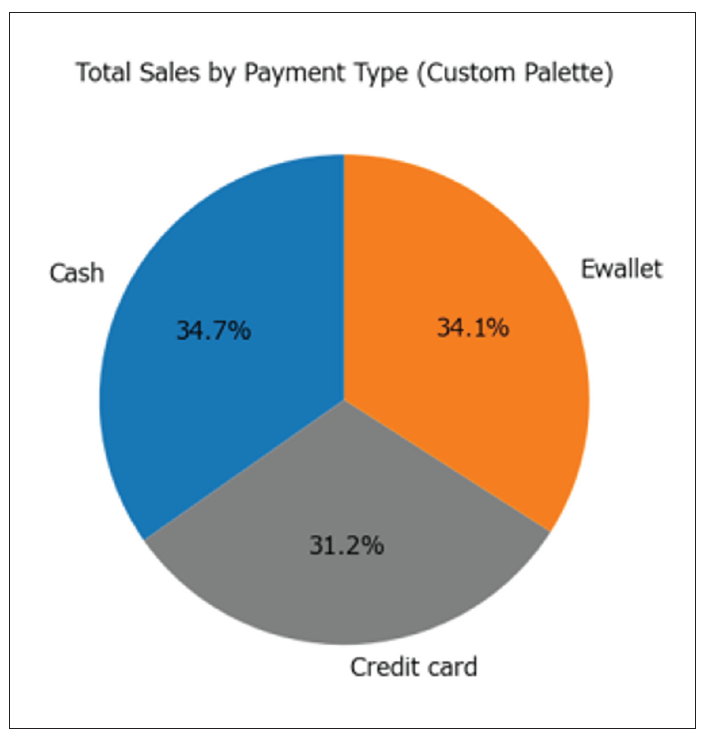
Now consider:
“Show the portion of Sales made by cash compared to other payment methods.”
Here, a pie chart has been created to show the portion of payments made by cash:
Similar effects will happen with other AI tools. These tools have been devised to provide charts in particular ways depending upon how the question has been phrased. As you train AI, it seems you have to train yourself, too.
Personalizing visuals
Personalizing visuals allows you to adapt dashboards and charts to your individual needs, whether by selecting preferred metrics, applying specific color themes, or arranging layouts to suit personal workflow. AI tools can learn from past interactions to suggest tailored visual configurations automatically, making analytics more intuitive and relevant.
AI tools like ChatGPT and Gemini can remember users’ preferences from previous chatting and create personalized visuals. For example, ChatGPT can learn from past interactions that a user may prefer to put charts horizontally instead of vertically to make comparisons and that a user may like a blue, orange, and gray color theme for the charts.
Before AI-assisted layout, the resulting chart might look like this:
After AI-assisted layouts have been understood, future charts might look like this, where you have specified them to be positioned side by side, for example:
Reviewing outputs
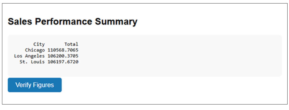
AI can also help users check, validate, and refine the visualizations and insights it has generated. As an illustration, after AI has generated a sales trend chart, the system might highlight an unexpected spike and ask:
“Do you want to investigate why sales jumped 40% last week?”
AI tools such as Power BI Copilot and Tableau’s “Explain Data” scan data for outliers and prompt users to confirm investigations before adding an explanation to the report. Indeed, after producing a text summary of sales performance, ChatGPT can add a “Verify Figures” button that links to the source table. It links visual insights back to raw data, so users can confirm numbers:
Word to the wise
There is a lot to take in. AI is almost in “arms race” mode, as there does not seem to be a day that goes by without changes to features that will revolutionize the accounting, finance, and business worlds. Visuals are essential communication tools that just get the key points over rapidly for business leaders to make decisions quickly and correctly.
As key professionals in such a dynamic, fast-paced ecosphere, it is our duty to keep on top of technology — AI or otherwise. It is essential to use tools such as the aforementioned to expedite and make our data preparation more efficient and automate and visualize it, so we can employ our skills in more value-adding ways.
About the author
Liam Bastick, FCMA, CGMA, FCA, is director of SumProduct, a global consultancy specializing in Excel training. He is also an Excel MVP (as appointed by Microsoft) and author of Introduction to Financial Modelling and Continuing Financial Modelling. To comment on this article or to suggest an idea for another article, contact Jeff Drew at Jeff.Drew@aicpa-cima.com.
LEARNING RESOURCES
The AI Advantage: Leveraging AI for Efficiency and Impact
In this fast-paced session, discover how AI-driven tools and strategies are revolutionizing workflows, improving decision-making, and driving business impact.
WEBCAST
AI-Powered Excel: Leveraging AI and ChatGPT for Supercharged Productivity
This course will have you streamlining your Excel work, research, and documentation, saving you time and effort in your day-to-day tasks.
WEBCAST
For more information or to make a purchase, go to aicpa-cima.com/cpe-learning or call 888-777-7077.
MEMBER RESOURCES
Articles
“Creating an AI Agent in ChatGPT,” JofA, Nov. 1, 2025
“AI-Driven Spreadsheet Tools — What CPAs Need to Know,” JofA, Oct. 2, 2025
“5 Ways AI Augments the Accountant’s Role,” FM magazine, Sept. 9, 2025
Website


