Create interactive dashboards with Excel PivotCharts and slicers
You can use Excel for creating interactive dashboards using PivotCharts combined with slicers to transform traditional, static reports into dynamic tools.
Q. How can I use Excel to turn static financial reports into interactive dashboards that decision-makers can explore?
A. You can use Excel for creating interactive dashboards using PivotCharts combined with slicers. These options can transform traditional, static reports into dynamic tools that let users explore financial performance by clicking on categories such as region, product line, or department. Instead of preparing multiple versions of the same report, accountants can build one dashboard that answers dozens of questions. Interactive dashboards are particularly helpful in budgeting, revenue analysis, cost control, internal audit, and management reporting.
The following instructions were created using Microsoft Excel 365 for PCs; other versions of Excel may work differently. If you would like to follow along in creating interactive dashboards, you can download this Excel workbook and view a video walk-through at the end of this article.
Let’s work through an example to create an interactive dashboard. This example shows how to build a revenue dashboard with region and product filters using monthly revenue data. The example company sells three product lines — tents, coolers, and lanterns — across four regions: North, South, East, and West. We will create a dashboard that includes slicers users can click to see how revenue trends change by region and product line over time.
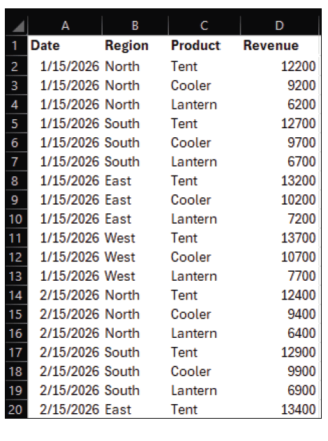
See the following snippet of the spreadsheet we will be using. It contains date, region, product, and revenue.
To prepare the data for analysis, click any cell inside the data range and press Ctrl+T to convert it to an Excel table. Make sure the My table has headers box is selected. On the Table Design tab, rename the table to SalesData. Using a table rather than a plain range ensures that the dashboard will automatically expand whenever new rows of data are added.
Next, create the PivotTable that will power the dashboard. With any cell in the SalesData table selected, go to the Insert tab on the ribbon and click PivotTable. In the dialog box, confirm that the Table/Range box references SalesData, select Existing Worksheet, and click somewhere to the right of the data as the location. Click OK. Excel inserts a blank PivotTable and opens the PivotTable Fields pane on the right side of the screen.
In the PivotTable Fields pane, drag Date to the Rows area, Product to the Columns area, and Revenue to the Values area. The PivotTable now summarizes revenue by product and date. To make the dates easier to interpret, right-click any date in the Row Labels area, choose Group, and then select Months and Years. Click OK. The PivotTable will now show revenue by month and year for each product line.
With the PivotTable selected, add a PivotChart to visualize the data. Go to the PivotTable Analyze tab on the ribbon and click PivotChart in the Tools group. Choose a 2-D Line chart and click OK. Excel inserts a PivotChart that plots monthly revenue for each product. You can move the chart so that it appears above or beside the PivotTable, depending on your preferred layout.
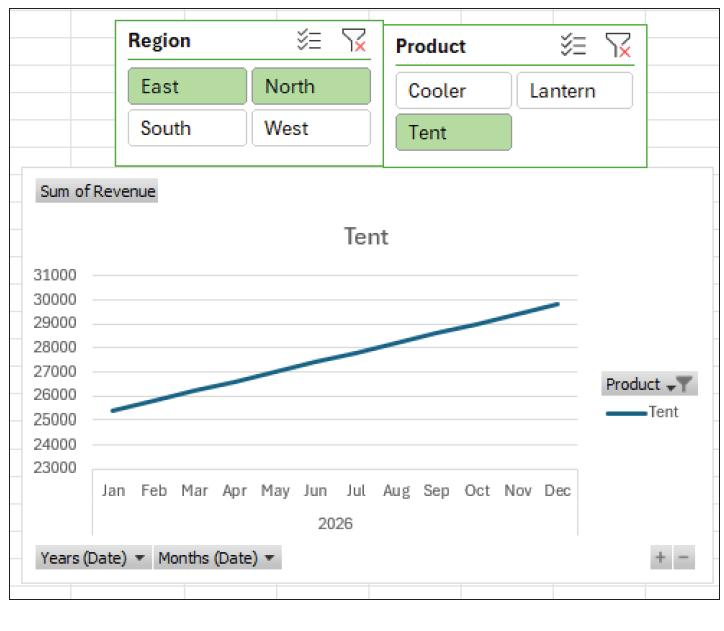
To add interactive filters, click anywhere in the PivotTable again, and on the PivotTable Analyze tab, click Insert Slicer in the Filter group. In the Insert Slicers dialog box, check Region and Product, and then click OK. Two slicer objects appear on the worksheet: one for Region and one for Product. Each slicer displays buttons for all unique items in its respective field.
Use the slicer settings to format the dashboard. Click the Region slicer and go to the Slicer tab on the ribbon. Adjust the Columns setting (in the Buttons group) so the buttons appear in two columns instead of one. Resize the slicer by dragging its borders, and then select a Slicer Styles color scheme of your choice. Repeat the formatting steps for the Product slicer. Arrange the slicers above the chart so users can change filters and immediately see the results in the PivotChart.
At this point, the dashboard is fully functional. Clicking a Region button filters the PivotChart to show only revenue from that region. Holding down the Ctrl key while clicking allows users to select multiple regions. Similarly, the Product slicer filters the chart by product line. The screenshot on the next page shows a finished version of the revenue dashboard, with the slicers at the top and the PivotChart displaying monthly revenue trends. You can also download a completed version of the Excel file used for this article.
PivotCharts and slicers can support a wide range of accounting tasks, including revenue tracking, budget-to-actual comparisons, departmental cost control, and performance reporting. Once set up, the dashboards update automatically as new data is added to the underlying tables, reducing the need for manual report preparation.
Excel dashboards built with PivotCharts and slicers are especially useful in meetings, where individuals often ask follow-up questions on the spot. Instead of leaving the meeting to run additional reports, accountants can apply slicer selections in real time to display the needed view. The result is a more interactive, insightful, and efficient approach to financial analysis.
About the author
Kelly L. Williams, CPA, Ph.D., MBA, is an associate professor of accounting at the Jones College of Business at Middle Tennessee State University.
Submit a question
Do you have technology questions for this column? Or, after reading an answer, do you have a better solution? Send them to jofatech@aicpa.org.


