- column
- TECHNOLOGY Q&A
Get into the flow with AI-powered app Miro
Related
What small firms are getting right about tech and why they’re not alone
Executive turnover slows, but AI strategy remains unclear
Use Excel dynamic arrays to build a revenue-testing schedule that auto-refreshes
TOPICS
Q. Is there a way I can visualize my standard operating procedures other than an outline document?
A. One of the best ways to visualize processes is with a flowchart. The flowchart app I use is Miro, which promotes itself as a “single, AI-powered collaboration platform.” With Miro, I can create shapes for different steps in a process, add text, connect the shapes, add icons and generate a link to the flowchart that I can add to my Standard Operating Procedure (SOP) document.
Here’s how I used Miro to build my flowchart. To follow along, go to miro.com and click the “Sign up free” button in the top right corner. You will then encounter a series of questions, which I recommend you answer based on your firm (as opposed to you individually). For the question “What kind of work do you do?,” I used Project Management. I suggest skipping the question about inviting others (you can invite other staff later).
On the last setup screen, Miro asked “Where would you like to start?” and I chose to “Start from scratch.” At that point, the blank board on which to build the flowchart loaded. A pop-up also opened, but I simply closed it and was then ready to begin building the chart.
Note that the first time you use Miro, the application will ask if you are using a trackpad or a mouse. I used a mouse, and Miro walked me through using the scroll wheel to zoom in and out and right-clicking to drag the board around.
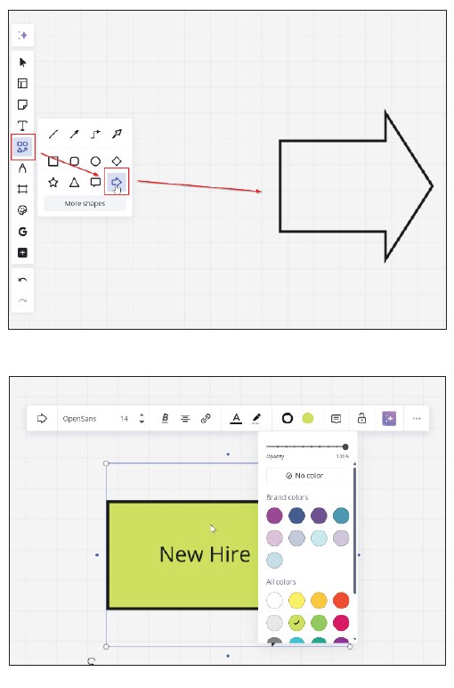
The first thing I did in building my flowchart was to add an arrow shape that I call my triggering action. To do this, I clicked on the Shapes option and dragged the arrow shape to the board, as shown in the first screenshot below. At that point, I typed “New Hire” into the shape (a cursor will appear), and I also changed the color to green, as shown in the second screenshot below.
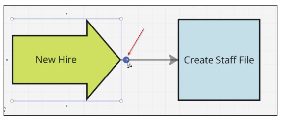
Next, I chose a square shape, added the text “Create Staff File,” and changed the color to a light blue. I then clicked on the arrow shape and dragged the small blue dot at the tip to the square shape (see the screenshot below). I used my right-click drag-and-scroll wheel to navigate the board as needed.
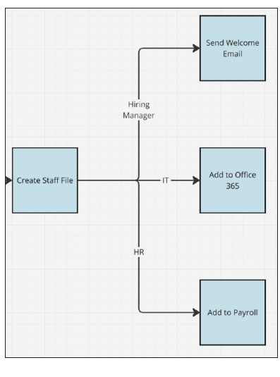
This is where my procedure splits into different departments, with human resources, IT, and the hiring manager each having tasks to complete. To show this in the flowchart required a branching path, which I built as follows.
First, I created three new squares by clicking on the “Create Staff File” and then clicking on the blue dot with the white arrow as opposed to dragging the blue dot. Doing this three times created the three additional squares. I added some space between the branching connectors and the “Create Staff File” square by left-clicking and dragging the new boxes to the right. To complete the branching, I annotated each path with the name of the department by double-clicking on the connector line and entering the department name, as shown in the screenshot below.
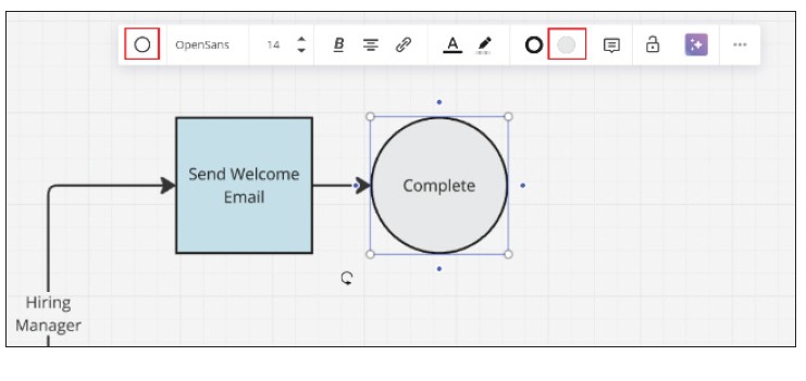
The next job was to work on each path. For the Hiring Manager path, I kept it simple and entered “Send Welcome Email” into the square box. The hiring manager has no more tasks in this flowchart, so I clicked the blue dot to create the next shape. The next shape was automatically a square, but I wanted to use a different type of shape for the end of the path. I clicked on the Switch Type icon and selected a Circle, as shown in the screenshot below. Note that I changed the color to light gray and entered “Complete” as the text.
For the IT connector, I had three steps to add: “Add to Office 365”; “Add to CCH Axcess”; and “Add to QBO.” To bring a bit more visual pop to these steps, I used the built-in Google image search to add icons to each step. I clicked on the + icon, typed “Google” and selected “Google Images.” I searched for “Office 365 icon” (see the screenshots below).
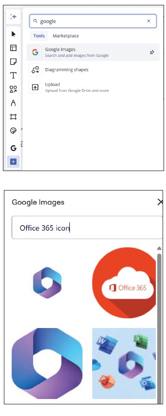
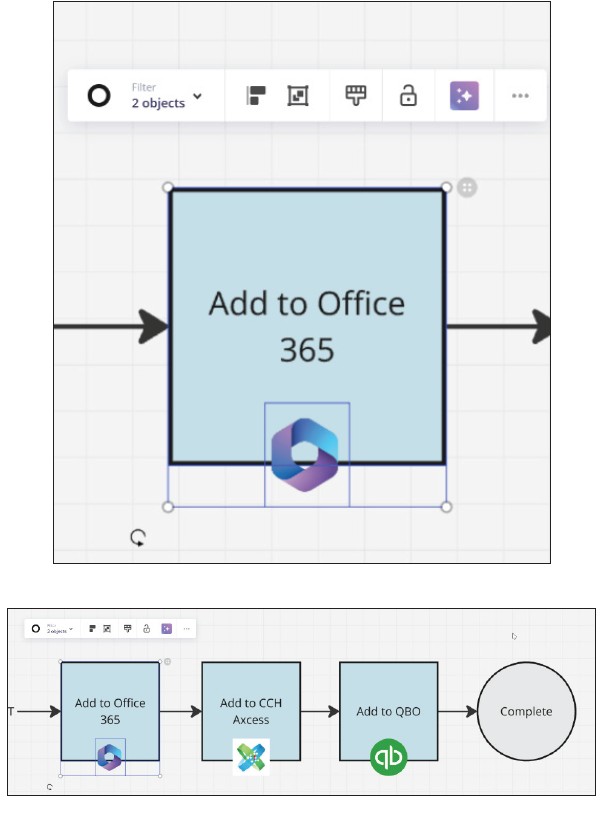
I dragged the image I wanted to use into the board. These icons always come in large, so I resized and placed it on the square for “Add to Office 365.” I then grouped the image and the square together. That way, if I need to move the square, then the icon will move with it. I repeated this process for the other two squares, as you can see in the second screenshot below.
On the HR connector, I entered “Add to Payroll” into the square already there and downloaded an icon for the payroll software (ADP in this case).
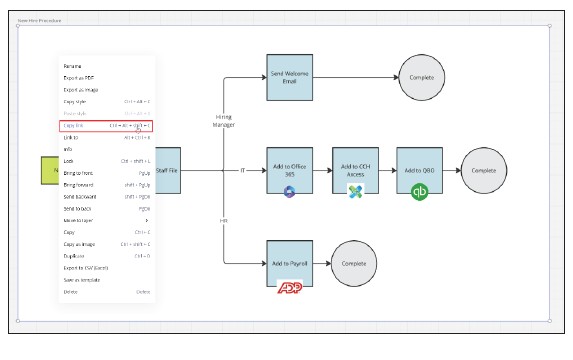
After completing the paths, I drew a Frame around the chart to help me easily distinguish between each chart. To do this, I clicked on the Frame tool and drew a rectangle around the chart. As I drew, Miro highlighted the shapes in the flowchart to automatically group them together in the frame. I renamed the Frame “New Hire Procedure.” Next, I linked this chart to my SOP by right clicking on the frame and selecting “Copy Link.” I then pasted this link into my SOP document.
Everything I did can be done using the free account for Miro. The free version allows unlimited users, but a maximum of three boards. If I were only creating flowcharts for my SOP, then I could put all the flowcharts on one board. In my business, I have boards for each of my clients to keep the tasks for each client separate — a situation where the paid version is required. One other feature I like on the paid version is the Brand Center, which allows you to add colors that match your branding.
Aside from flowcharts, Miro offers templates for several other visual aids — e.g., Mind Maps for mapping out ideas with details, Organizational Charts to organize staff, and Swimlanes to map a procedure as the task goes between departments.
About the author
Wesley Hartman is the founder of Automata Practice Development.
Submit a question
Do you have technology questions for this column? Or, after reading an answer, do you have a better solution? Send them to jofatech@aicpa.org.


