- feature
- TECHNOLOGY
Power BI: An analytical view
If a picture is worth a thousand words, then data visualization applications such as Microsoft’s are worth a look.
Please note: This item is from our archives and was published in 2020. It is provided for historical reference. The content may be out of date and links may no longer function.

Related
Excel vs. Tableau: See your data differently
Keeping up with deadlines using a dynamic spreadsheet
Accountants often are tasked with tracking the performance of their organization (or client organizations). That process usually requires referring to multiple sources to gain insight on the trends of the organization, its industry, and even its competitors.
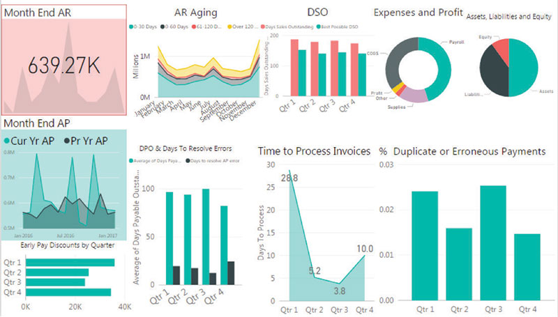
Critical data monitoring the pulse of an organization can be summarized in custom format in one (or more) visuals, perhaps in a dashboard such as the one shown in the screenshot “Dashboard Example.”
Imagine accessing those results and comparisons automatically refreshed, on demand, from your PC, tablet, smartphone, or even wearable device. That’s the power of business intelligence and data visualization. (See the sidebar “Business Intelligence, Data Visualization, and CPAs.”)
CPAs can choose from a number of business intelligence and data visualization applications, with the two most popular in the accounting space being Tableau and Microsoft Power BI. Other names to know include Adaptive Discovery, Google Charts, Qlik, Wolters Kluwer’s TeamMate Analytics, and Zoho Analytics.
Tableau and Power BI are similar in many ways but have some significant differences, which are detailed in the sidebar “Power BI vs. Tableau.”
For more on Tableau, see the accompanying article, “Excel vs. Tableau: See Your Data Differently.” That article and this one are not meant to be exhaustive examinations of Power BI and Tableau, but rather introductions to how to use the two software packages.
This article focuses on Microsoft Power BI because it combines data extraction, transformation, and load tools already in Excel (namely PowerPivot and Power Query) with robust modern styles of interactive analysis and visualizations.
Microsoft introduced Power BI in 2014 and continues to make improvements. It connects seamlessly with Microsoft Excel and proprietary products including Google Analytics, Microsoft Dynamics, QuickBooks, and many more.
Dashboard example
WHICH IS BETTER: POWER BI OR EXCEL?
Power BI works very well with Excel, as the two Microsoft products complement each other. Excel is a great source of data for Power BI, which can receive data from hundreds of possible sources. Power BI is a great choice for a vast array of visualization options, higher-level analytics, automatic updates upon changes to source data, very large sets of data, and user interaction, among other uses.
While Excel is used mostly for simple analytics, as explained in more detail in the aforementioned “Excel vs. Tableau” article, Power BI allows users to create dashboards and reports with at-a-glance looks generated using data stored on-premises or in the cloud. The software provides a “canvas” for the user, as well as many visualization tools for displaying information to users. Visualizations can summarize data from millions of records instantly. For the first-time user, Power BI has a shorter learning curve than Excel.
CREATING A REPORT IN POWER BI DESKTOP
Power BI has two user interface tools — the Power BI Desktop (available for installation at click.linksynergy.com and the Power BI service accessible through Microsoft Office 365. (If you do not have a Microsoft account, you can set one up at signup.live.com.) The Power BI Desktop allows users to create and publish reports from which dashboards can be rendered from the Power BI service.
To illustrate how to prepare a sample report and dashboard in Power BI, this article walks through sample data for a fictitious petroleum company. You can download an Excel file with the data here.
To access the data for the report, open the Power BI Desktop and select Get Data from the ribbon (as indicated by the top red arrow in the “Get Data and Report View” screenshot).
Get data and report view
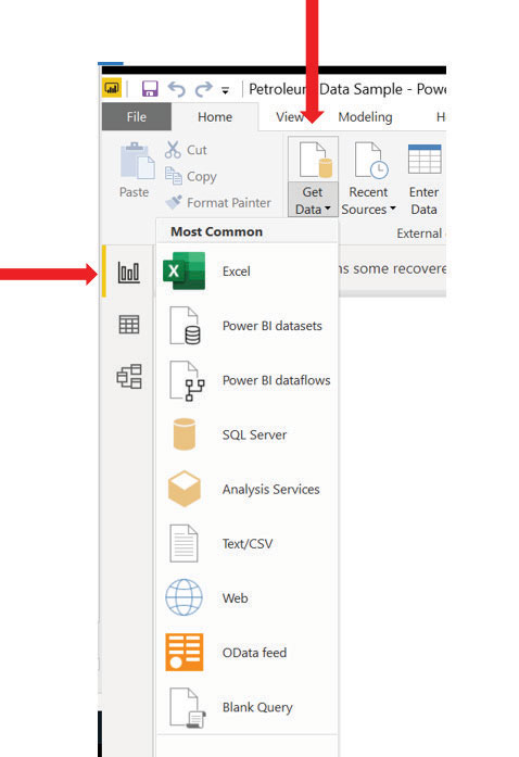
Before we continue, please note the icons for the three view modes of the Power BI Desktop on the left white bar (as shown in the same screenshot). The top icon in the left white bar is the Report View, which allows users to create reports with visualizations. Next is the Data View, which allows users to see and explore data after it has imported to the Power BI desktop application. The third icon on the left bar accesses the Relationships View, which shows tables, columns, and relationships being used in the current model. It also allows users to create relationships between tables using matching columns.
With the Report View highlighted, click Get Data and select Excel from the dropdown list of options, as shown in the “Get Data and Report View” screenshot.
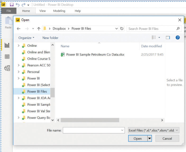
Next, select and open the “Power BI Sample Petroleum Co Data” Excel file from the location where you save the file (see the screenshot “Opening Data From Excel File”).
Opening data from Excel file
Power BI establishes a connection with the file containing the sample data. The “Power BI Sample Petroleum Co Data” file contains 10,188 sample data rows. Click the box to the left of the “All Data” worksheet name. Sample rows and columns from the data file will appear on the right, as shown in the screenshot “Loading the Data.”
Loading the data
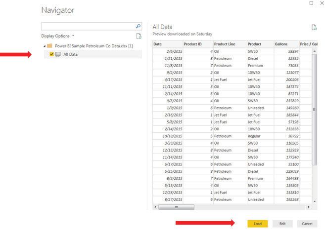
Select the Load button on the bottom right to load the data in Power BI.
After the data is loaded, field names (which represent the columns in the worksheet data) appear under the Fields section of the desktop (shown in the “Select Fields” screenshot). Note that the fields appear in alphabetical order. Power BI currently has no method of arranging the fields to the order shown in the worksheet (an improvement that will hopefully be made soon, but one possible workaround is to begin the name of each column with the column letter.)
Select fields
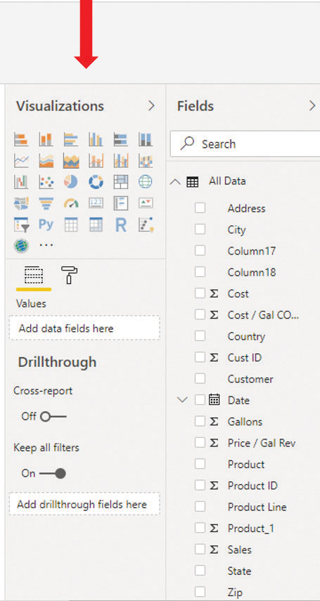
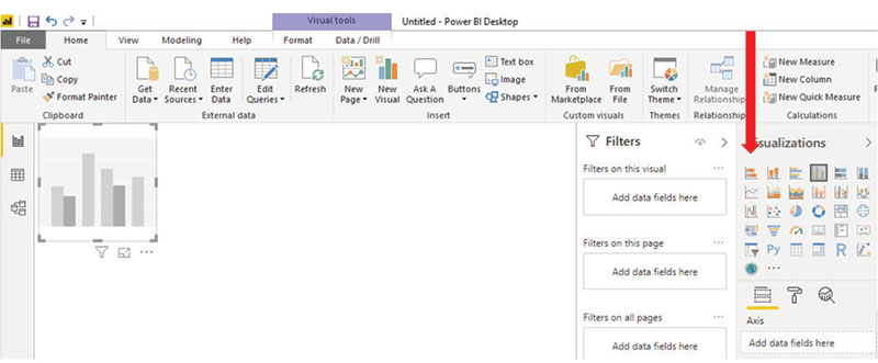
To the left of the Fields area, you will see the Visualizations area. Move your mouse over the icons to see the description of each visualization. To create a visualization, click on the bar chart (see the Clustered Column Chart visualization highlighted by the red arrow in the screenshot “Creating a Visualization”). A grayed-out graph appears on the white area known as the canvas.
Click on the visualization in the canvas. When selected, the visualization is surrounded by a frame that includes bold corners and sides to click and drag for sizing.
Creating a visualization
HOW TO CUSTOMIZE A VISUALIZATION
Let’s create a visualization comparing Sales and Cost by Date.
Left-click and drag the Date field from the Fields list to the graph on the canvas. Release the left mouse key when the Date field is within the visualization frame. Repeat this process for the Sales and Cost fields. Click, drag, and drop each field into the graph. Each field can also be placed into the selected visualization by clicking the box to the left of the field to be included, as shown in the screenshot “Building Graph With Date, Cost, and Sales.”
Building graph With Date, Cost, and Sales
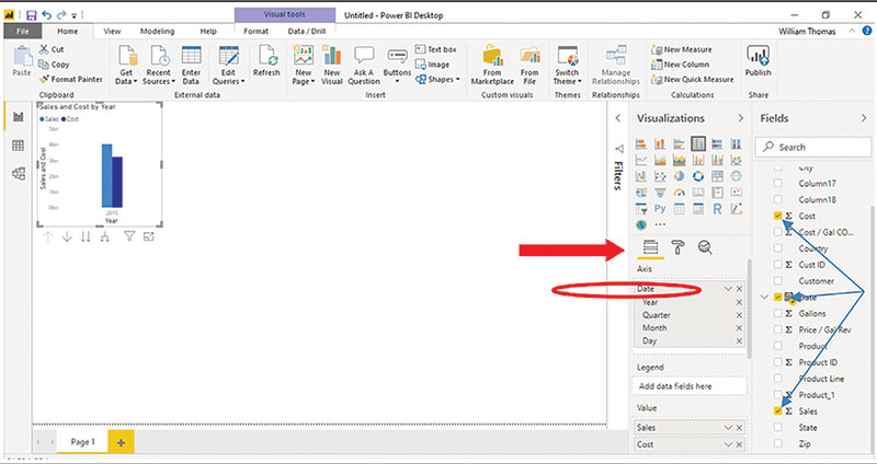
At this point, data is shown for the full year. To show by quarter, make sure the Fields button (shown below the Visualizations section) is selected. Remove the year (click the corresponding “X”) from the Date format section (circled in red). Removing the “Year” format adjusts the chart to show data by quarter, as shown in the screenshot “Sales and Cost by Quarter.”
Sales and Cost by quarter
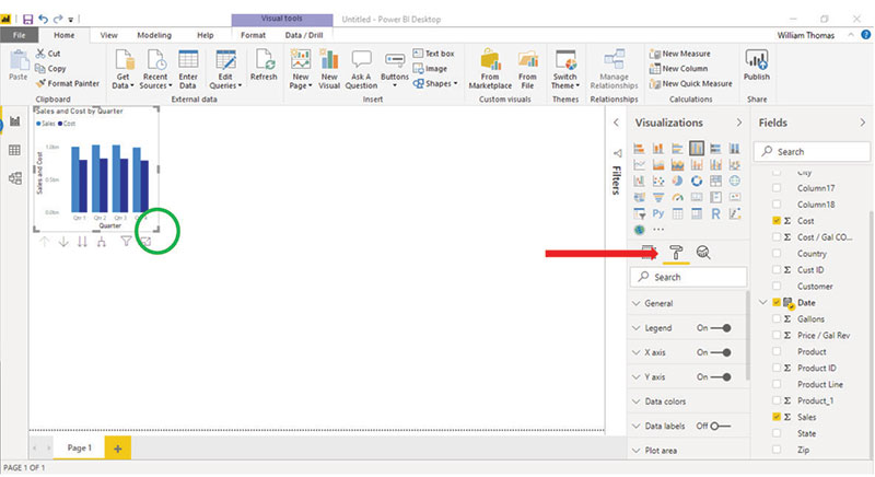
Enlarge the visualization by right-clicking and dragging the bottom corner of the graph visualization to the center of the canvas, as indicated by the green circle in the screenshot.
Formatting visualizations is easy. Click the Format icon (see the icon to the right of the red arrow in the screenshot). Note the format options that appear below the icon. The title, X-axis, and Y-axis are in need of reformatting.
FORMATTING THE GRAPH
Let’s start by reformatting the title. To size the font of the graph title, click the Title down arrow (circled in orange in the screenshot “Formatting the Graph”).
Formatting the graph
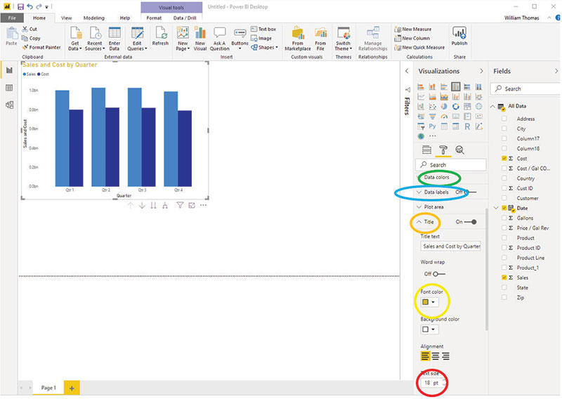
Change the font size to 18 (circled in red) and change the color of the font to gold (circled in yellow). Repeat these steps to resize the X-axis and the Y-axis labels (you can change the color if you like, but I did not). The color of the bars in the graph can be changed by selecting Data colors (circled in green) and selecting a desired color for each bar. To show volumes over each column, click Data labels (circled in blue) and move the toggle switch to On.
Next, we are going to show the values for sales in dollars on the screen.
First, create a new visualization by clicking a blank space on the canvas (outside of the current visualization area). Select the Card visualization, which shows 123 on the icon.
Left-click the Sales field and drag it into the new visualization in the bottom left of the canvas. The total Sales amount for the year is shown in the visualization, as shown in the screenshot “Adding the Sales Field.”
Adding the sales field
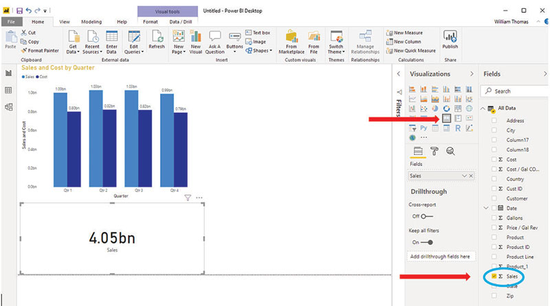
Let’s add a “Map” visualization to show sales activity by location. Click on the canvas in the open space to the right of the Sales and Cost by Quarter visualization.
Clicking the Map icon
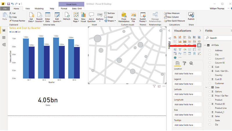
Click the Map icon (small globe highlighted by the red arrow in the screenshot “Clicking the Map Icon”). Left-click, hold, and drag the Gallons field and State field into the Map visualization, producing the image shown in the screenshot “Map Visualization.”
Map visualization
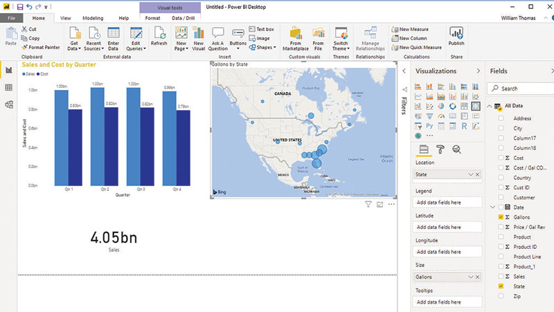
Note the locations are shown as a circle sized by volume (i.e., larger circles represent higher volume compared with smaller circles). Left-click, hold, and reposition the visualization under the Card visualizations.
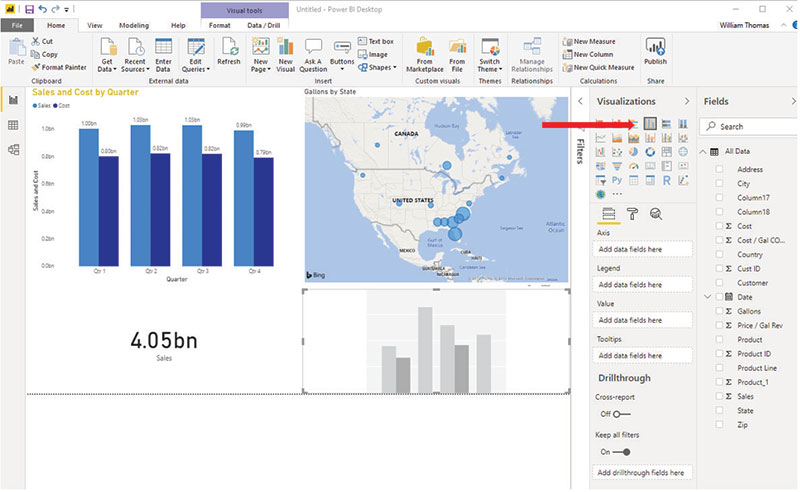
Next create a Clustered Column Chart to illustrate customers and respective volumes comparatively.
Click on the canvas in the blank space to the right of the Sales visualization. Select the Clustered Column Chart (highlighted with a red arrow in the screenshot “Adding Customers and Volumes”).
Adding customers and volumes
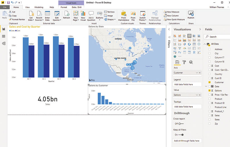
Left-click, hold, and drag the Gallons and Customer fields into the chart. The result is shown in the screenshot “Gallons by Customer.”
Gallons by customer
INTERACTING WITH THE DATA
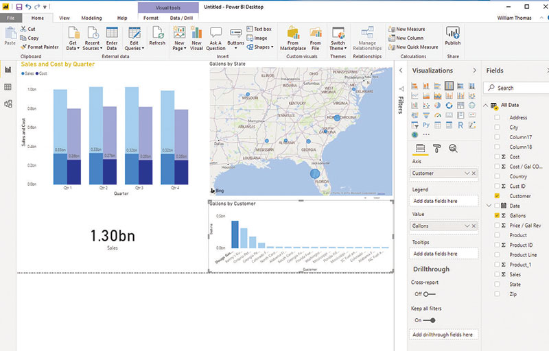
The sample report is now complete and interactive. For example, click on the “Dougs Gas and Oil” bar located in the Gallons by Customer visualization.
All visualizations are linked and change as the user interaction changes. For instance, note in the screenshot “Customer-Specific Visualization” how data in the visualization is highlighted to reflect the volumes (in the Sales and Cost by Quarter and Sales visualizations) for the customer “Dougs Gas and Oil” as well as the locations on the map with larger volumes shown in larger circles. To restore, click a second time on the same visualization area. You can click on any of the visualization elements and see a relative change to all visualizations for the selected item. If sales in Florida are clicked, the visualizations on the canvas will change to reflect the sales and cost by quarter, total sales, and individual customer sales for Florida.
Customer-specific visualization
PUBLISHING TO THE POWER BI SERVICE AND SHARING WITH OTHERS
If you have Microsoft Office 365 or you have purchased a subscription to either Power BI Pro or Power BI Premium, you can publish your report to be shared on multiple devices and with others who have any of these services. To do so, save the report by selecting the Publish button and follow the prompts to publish your report. Power BI will save the report to your Microsoft account. (You may be prompted to reenter your Microsoft password.) Click the Got It button when Success appears on the screen.
Note that when the data in the Excel file changes, the changes will be refreshed in the Power BI report when reopened or updated.
Power BI provides many more benefits to organizations. For example, multiple files from multiple sources (including data from websites, databases from other programs, etc.) can be extracted, transformed, and loaded into a report and/or dashboard. In addition, questions can be asked and answered in everyday language (such as “annual sales for first quarter”) as an additional interactive benefit.
This example was just a glimpse of the power of Power BI. Much more can be done with this powerful tool.
This software is a powerful business intelligence tool for CPAs in organizations of all sizes. No longer is the power of business intelligence limited to a privileged few. Where cost and complexity previously prohibited many from using business intelligence in their organizations, this relatively new and continually improved software provides affordability and simplicity for CPAs at organizations of all sizes to use BI to manage and monitor their organizations.
Business intelligence, data visualization, and CPAs
The synergistic combination of data used to make sound business decisions is called business intelligence.
CPAs have found business intelligence useful for the following purposes:
- Budget analysis and reporting;
- Key performance indicator analysis and reporting;
- Predictive analytics in auditing;
- Forecasting and reporting;
- Analysis of audit samples and tests; and
- Many, many more.
The process of presenting that data in visually compelling ways is called data visualization.
Power BI vs. Tableau
Competition in the data analytics and business intelligence space became even more interesting in June when Salesforce announced a deal to buy Tableau Software in an all-stock transaction worth about $15.7 billion.
That price tag certainly was noteworthy, but it’s a different kind of pricing that represents one of the biggest differences between Tableau’s data visualization software and Microsoft Power BI.
Individuals can use Power BI for free, while a Power BI Pro subscription costs businesses $9.99 per month per user (billed annually). Large organizations looking for big data analytics and storage can pay $4,995 per month per dedicated cloud computer and storage resource with an annual subscription.
Tableau charges individuals $70 per month (also billed annually) for what it calls Tableau Creator, which essentially provides full access to the features of its analytics software. For businesses, Tableau requires at least one Tableau Creator account and offers limited editing privileges through Tableau Explorer ($35 per user per month with at least five users) and viewing access through Tableau Viewer ($12 per user per month for at least 100 users). All plans require an additional $8.50 per month per user to cover data and server management.
Another significant difference between Tableau and Power BI is that Tableau runs on both PCs and Macs, while Power BI runs only on PCs.
— By Jeff Drew
About the author
W. Stewart Thomas, CPA, CGMA, Ph.D., is an associate professor, associate dean of the School of Business, and former vice chancellor at the University of North Carolina at Pembroke.
To comment on this article or to suggest an idea for another article, contact Jeff Drew, a JofA senior editor, at Jeff.Drew@aicpa-cima.com or 919-402-4056.
AICPA resources
Article
- “Excel vs. Tableau: See Your Data Differently,” March 2020
Conferences
- Practitioners and TECH+ Conference at AICPA ENGAGE, June 7—11, Las Vegas
- Digital CPA Conference, Dec. 6—9, Orlando, Fla.
Webcast
- “Introduction to Data Analytics and Microsoft Power BI Tools,” April 13 (#VCXOPBIS120040)
For more information or to register, go to aicpastore.com or call the Institute at 888-777-7077.
IMTA Section and CITP credential
The Information Management and Technology Assurance (IMTA) Section supports AICPA members who provide services in the areas of information security and cyber risk, privacy and IT risk management, business intelligence, and emerging technologies. CPAs may also pursue the Certified Information Technology Professional (CITP) credential, which demonstrates an individual has the expertise to advise organizations on how to maximize information technology to manage their business. Access to IMTA tools and resources is included with AICPA membership. To learn more, visit aicpa.org/IMTA and aicpa.org/CITP.


